What are famous photographers doing right on their websites? Or better yet, what are they doing awfully wrong despite being successful?
In this detailed research report, I thoroughly reviewed over 100 individual websites (from the most well-known photographers out there) to try to uncover all of that.
You’ll find a goldmine of statistics and data, all about photography websites, telling the story of where the industry is going.
This is the type of research I wish I’d found when working on my first photography website.
Enjoy this report, and please email me at hello@foregroundweb.com or leave a comment below if you have any questions.
I hope you find it useful!
Alex Vita
Web-designer for photographers & writer here at ForegroundWeb
TL;DR
Many photographers are successful despite having horrible websites.
This research project started as a way to discover what popular photographers are doing right on their sites so that others can learn from it.
Such best-practices do exist, but it mostly turned out to be a serious list of “what not to do” on a photography website.
Read this whole report to see some interesting stats:
- 67% of famous photographers have the website under their personal name
- 13% of websites risk “duplicate content” penalties by being accessible at both “www” and “non-www” domains
- 15% of websites still don’t load on a secure HTTPS connection
- Compared to its measly 2% global market share, Squarespace is used by 18% of top photographers.
- How many items do you have in your navigation menu? Photography websites out there have anywhere between 2 and 26 links!
- 39% of all photography websites don’t have a footer
- Guess how many of these websites have music auto-playing in the background? ZERO. All is good in the world.
- Half of all websites use free font faces from Google Fonts.
- 85% of websites DON’T include any sort of contact information on the homepage, and 44% of websites DON’T have an email address on the Contact page
- Photographer Bio pages range from just 5 words to 4864 words in length.
- Even though photographers include anywhere from 3 to 300+ images per portfolio gallery, the sweet spot appears to be around 15-20 images.
- A whopping 93% of popular photographers DON’T watermark the images on their websites.
- 69% of websites have a blog area, but some have been completely abandoned for 2+ years.
- 77% of websites don’t have image ALT tags.
- Instagram is the most widely used social media platform among top photographers (98%!), with more than half of them having more than 100K followers there.
- and much more…
Contents
1. Domain names
Top-level domain (TLD)

“.com” is the king of Top Level Domains, with 91% of all websites.
All other options (whether they’re the generic “.net” or country-specific TLDs like “.com.au” or “.co.uk”) together make up the remaining 9%.
What matters is where your target audience is located. But even if they’re mostly not from the US, choosing a .com domain is still a safe bet. Search engines don’t rank .com ahead over others, so it’s just a matter of what’s easiest for people to use and share (for which .com is the winner, it’s been around for a long time).
And if you have a website in a different language, it’s also OK to have a regular .com domain. Google doesn’t look at the “.com” part and this that it’s English straight away. It has other ways of determining the language of a website (using special HTML meta tags and by simply sampling some text on the site and detecting its language). Many non-English websites out there use .com because it’s the easiest to remember; it’s the most popular.
In all the websites I reviewed here, there was no sign of any fancy photography-specific new TLDs (like “.photography” or “.pictures”, etc.)
Domain name length

When it comes to the length of the domain name for your site, size matters! :-)
The shorter the domain, the easier it is to type and remember.
A common mistake that photographers make is to include their specialty in the domain name (in a desperate effort to please the SEO gods). But after a few years, they outgrow that specialty and they have to switch to a simpler domain (and doing such a URL transition is not easy).
DDON’T box yourself in with a long domain name that includes your specialty and/or location. Keep it simple by just getting a domain that reflects your name (or your brand).
The shortest domain name in this study: lik.com (3 characters + TLD)
The longest domain name in this study: mmarchitecturalphotography.com (26 characters + TLD)
Domain uses “photo” or “photography”

This is proof that you don’t need to include “photography” (or other variations) in your domain name to be successful.
While keywords in the domain name are considered small ranking factors, they’re not as important as people think (out of hundreds of other SEO factors).
Google confirmed this a while back when tweaking their algorithm to download “keyword-stuffed exact-match domains”.
“…just because keywords are in a domain name doesn’t mean that it’ll automatically rank for those keywords. And that’s something that’s been the case for a really, really long time.” – John Mueller from Google
Furthermore, you lose the flexibility of expanding your website in the future to cover services outside of photography (like videography, or… who knows where the industry is heading in a few years).
Website under a personal or a brand name

Two-thirds of professional photographers prefer an online presence under their personal name, as opposed to working under a brand/business name.
But navigating this decision comes down to many factors:
- if you have a difficult hard-to-spell name, then going for a cleaner brand name might be beneficial
- if you plan on building a larger business (with a team of photographers and assistants), or if you’re goal is to sell the business in the future, a brand name is the better fit
- on the other hand, a simple personal-name domain is easier to find and remember and gives you more flexibility to change photography niches in the future
- personal domain names signal that you’re a one-personal business and might make you more relatable and easy to work with. And since business success depends on “trust”, a personal domain might be to your advantage.
Website loading on www or non-www (or both)

Using the “www” sub-domain is optional, yet most photographers opt to use it for their websites.
And sometimes, they’re forced into it: some platforms (like PhotoShelter or Smugmug) allow you to use custom domains but require you to set up a sub-domain (usually “www”) as a CNAME DNS field, so loading your root domain directly (aka “non-www”) is not an option. But it then becomes the site owner’s responsibility to make sure that the root domain (hosted somewhere) is appropriately redirecting to the correct sub-domain (with or without an HTTPS connection!)
Whatever path you choose, simply make sure that you add redirects from one to the other; otherwise, you risk a duplicate content penalty. If your website is accessible both with and without “www” in front, it might be seen by Google as two identical websites. About 13% of photographers make this mistake.
Website loading on HTTP or HTTPS (or both)

The fact that 15% of photography websites still cannot load on a secure HTTPS connection is alarming. They’ll likely suffer in rankings and show warnings when loading in all major browsers.
The idea scenario is when your website loads on HTTPS (for which you need to get an SSL certificate from your hosting provider, usually for free), and only on HTTPS.
Yet some websites allow loading on regular HTTP even if they already support HTTPS, which again is considered a pretty big problem for SEO (because they can be regarded as two separate websites showing the same content).
To avoid being stuck in that “Both” category (in the chart above), make sure your site has a redirect from HTTP to HTTPS. For WordPress users, using the “Really Simple SSL” plugin make this a breeze.
2. Website specialty, platform & structure
One or multiple photography websites?

Most successful photographers have one single website (on one domain), trying to keep everything under the same roof even if they cover multiple specialties.
However, many have opted to create multiple websites. When deconstructing this, here are some reasons why photographers opted for separate sites:
- they don’t want to mix completely unrelated niches
- marketing for separate websites is more straightforward if they’re each focused on a different target audience (although it obviously takes more time)
- they want to keep their portfolio website completely clean and separate from their other offerings
- as their business grew, they needed separate full-featured websites for their new ventures (education sites, online stores, collaborations with other photographers, etc.)
If you like shooting multiple types of photography, the decision of whether to have one or more websites can be difficult. Check out this dedicated article to help you make a decision: Having separate photography websites or merging them?
Photography niche

This is a rough overview of the photography specialties of the most popular photographers in the world.
These “categories” are subject to interpretation. Here’s what sub-specialties they contain:
- Travel = all specialties where nature or man-made structures are the focus. This includes fine-art photographers, those shooting landscapes, photojournalism, environmental, or photographers doing commercial projects across the world.
- Portrait = photographers shooting families, newborns, maternity, groups, pets, fashion, etc. All specialties where humans are the main focus.
- Wedding = although wedding photographers could have also been placed in the “Portrait” category, I decided to keep them separate in this chart.
- Architecture = just that, architectural photographers, intentionally kept separate.
- General = anything that doesn’t fall under the other categories, or “jack-of-all-trades” photographers
Please excuse the “blurry lines” and “overlaps” between some of these niches, otherwise, this chart would have been a colorful array of 20-30 unique sub-specialties :-)
Photography website platforms

WordPress is the number one choice for professional photographers, with 31% using WordPress alone and another 11% using hybrid sites (combining WP with other photography-specific platforms like PhotoShelter or SmugMug).
Squarespace shows excellent usage stats among famous photographers, much above the global market share of around 2%.
Around half of all photography websites are served by WordPress or SquareSpace. The remaining sites use a plethora of other platforms (some generic, some specific to photographers). Here’s the full list in decreasing usage percentages:
- PhotoShelter
- SmugMug
- Shopify
- Adobe Portfolio
- Format
- Custom PHP
- Drupal
- Laravel
- Showit
- Photofolio
- Wfolio.ru
- LiveBooks
- Photobiz
- Blogspot
- Kajabi
- Joomla
- Blogger
- GoodGallery
- Adobe ColdFusion
- Widerange Galleries
- Portfoliobox.net
- Craft
- Ruby
- Prestashop
- Adobe Dreamweaver
- Ruby on Rails
- Portfolio.com
Check out some of my other articles for how WordPress stacks up against photography-specific platforms and what tools you can use to sell prints and licenses on your site.
3. Website design
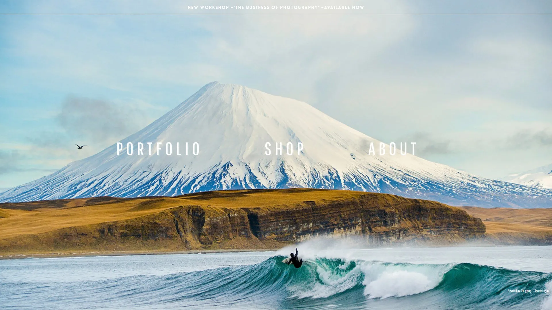
Website header position

“Familiarity” is a significant factor in website UX (user experience): if visitors understand the “design language” of your websites, they’ll have an easier time navigating it and are more likely to stick around.
Popular photography websites appear to follow this best-practice, with most websites optin for a normal header position at the top of the site and a few with left-aligned headers.
As expected, there were a few exceptions, with some websites hiding the navigation menu behind a “hamburger” 3-lines icon or placing the menu at the bottom of the screen.
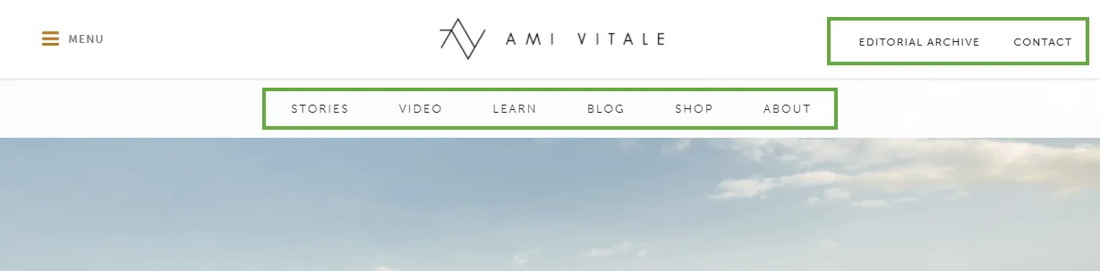
Top-level navigation menu items

Web-design guidelines recommend between 5 and 7 items in the navigation menu, inspired by some (rather old) studies about how many things people can keep in their short term memory.
Most popular photography websites appear to be following this unwritten rule, although more than 30% have 8 or more menu items, going up to 14-15 in rare cases.
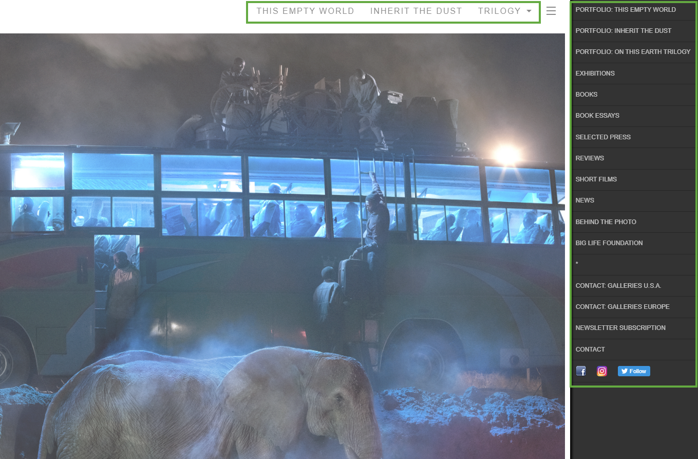
And if you paid attention to the chart above, I reviewed a site with… wait for it… 26 different menu links at the top of the site. Talk about being confused when trying to navigate that site! Here’s a screenshot below:

Total number of navigation menu items (including dropdowns)

Besides the top-level menu items, websites often employ dropdown menus or secondary menus to include more header links.
Web-design guidelines are more relaxed in this department, letting you arrange more pages in the navigation menu dropdowns if it makes sense for visitors to navigate your site.
Many photography websites don’t use dropdowns at all; that’s why the first part of this chart looks pretty similar to the previous one.
But you can also clearly see examples of photo websites using dropdowns to include a lot more links, up to 65 links in total in one case. Although this sounds like a huge number, it’s all nicely organized into sections so that it can be done in good taste:

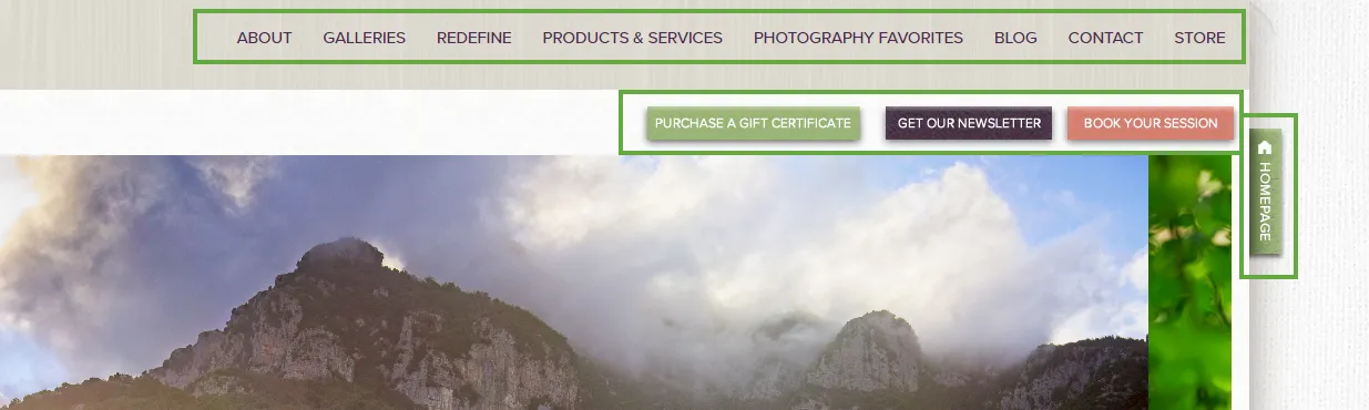
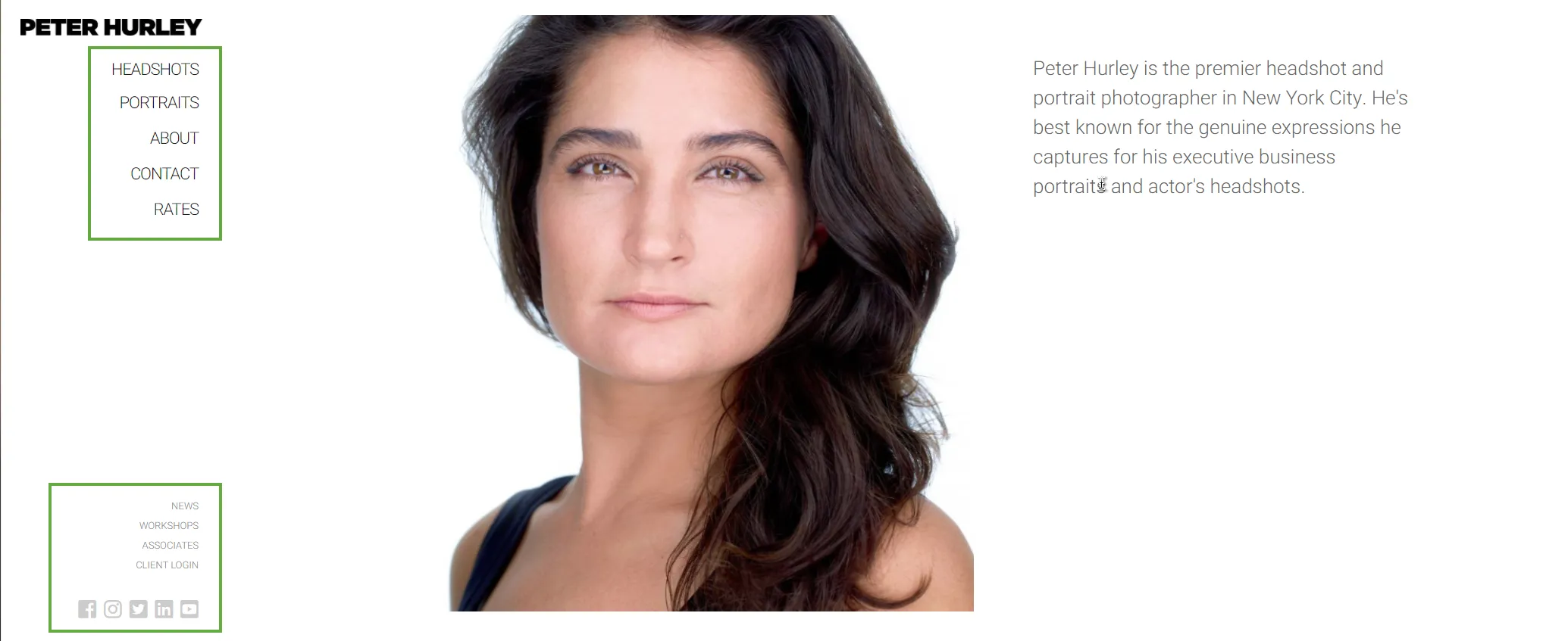
Using a secondary navigation menu?

The big difference in numbers between “top-level menu items” and “total menu items” does not only rely on dropdown menus.
Some photography websites use secondary navigation menus or “sections” to include links and organize items into “groups.” A few essential menu items in a prominent place, while many others are sometimes hidden behind hamburger icons or placed in less-prominent locations.
Here are a few examples of secondary menus used by famous photographers:
For a full guide on how to improve your site’s menu, check out: Navigation menu best‑practices for photography websites
Using website footer?

Not surprisingly, most famous photography websites have a footer area (which gets displayed on all pages throughout the site), which includes things like:
- a repeat of the navigation menu
- contact information
- social media profile links
- social media feeds (especially Instagram)
- newsletter subscribe boxes
- promos and special messages
- copyright notes, terms and conditions, etc.
These stats don’t count a single “© Copyright Jane Doe. All rights reserved.” line as an actual footer.
Website background color

White is the undisputed king of background colors when it comes to photography websites. It looks clean, and it doesn’t distract visitors from the stars of the show: the actual photos.
Photography websites opting for backgrounds in black or dark shades of gray only make up around 12% of all reviewed sites.
“Light gray” considered for anything “above” #BBBBBB (but not full white).
“Dark gray” considered for anything “below” #333333 (but not full black).
Website using a splash/intro page

I define “splash page” as an intro page that shows on instead of the homepage when you first load a website, usually offering just a button or a few links to enter the website, but blocking access to the navigation menu.
A few “popular” photography websites in this study were guilty of making this mistake.
Splash pages are awful for user experience because they’re blocking access. They’re forcing visitors to see a single image or a slideshow and click a specific button to access the full website. And when people lack options, they sometimes leave.
Websites with splash pages have huge bounce rates simply because of the lack of browsing freedom that it gives visitors. Sure, they might be “fancy,” and they might include a powerful background image that impresses visitors. Still, they could accomplish the same “visual impact” with the same image at the top of a regular homepage, where the navigation menu is fully accessible from the start.
Allow me to use an analogy: imagine going into a store, but at the entrance, there’s another small room forcing you to look at one single featured product and a door with a sign that says “Enter store.” Wouldn’t that be annoying?
A few examples of photography website splash pages:
Website auto-playing audio in the background

My favorite statistic in this whole research project :-) This chart was really hard to put together.
All famous photographers do a good job of NOT including any auto-playing musing on their websites. Not even the wedding photographers (who are sometimes known to make this mistake).
All is right in the world!
Font face used for headings

Looking at the chart of common fonts used for heading tags, there doesn’t appear to be a clear winner, with options spread over 61 different font faces in roughly twice as many websites.
But if you look more closely, there is a common thread among them: about 25 of those options all come from the free Google Fonts library.
With Google Fonts being integrated into many platforms and WordPress themes (and, of course, because they’re free), many photographers use them on their websites. In fact, 48% of all popular photography websites use Google Fonts!
Here are all the font faces that got lumped together in the “Other fonts” category in the chart, in alphabetical order: Brandon Grotesque, Cabin, Californian FB Display, Cherry, Clarendon Wide, Cormorant Garamond, Crushed, Din 2014, DIN Next Pro, Eb Garamond, Europa, Filosofia Grand Basic, Fjalla One, Freight Sans Book, Garamond Premier Pro Display, Garamond Premier Pro, Gotham, GT America, Heebo, Helvetica, Josephin Sans, Kopius, Linotype Didot, Lora, LTC Bodoni 175, Lynotype Pro, Minion Pro, Mr de Haviland, Museo Slab, Noto Serif, Planet Book, Prestige FS, PT Sans Narrow, Quarto A, Rosarivo, Salsa, Spartan MB, Stratum 2, Titillium Web, Ubuntu Condensed, Ubuntu, Varela Round, Viva Beautiful, Wanderlust Letters.
Font face used for body copy

Similar results for fonts used in regular body text, but with Open Sans (also from Google Fonts) moving into the top stop here.
One notable insight here, though: greater use of sans-serif fonts here (as opposed to heading font faces, which included more serif options).
Font faces in the “Other” category in the chart (in alphabetical order): Alegreya, Apercu, Avenir, Baskerville, Brandon Grotesque, Cabin, Californian FB Display, Century Gothic, Chivo, Clarendon Text, Crimpson Text, Din 2014, Din Next W01, Eb Garamond, FF Din Web, Filosofia Grand Basic, Freight Sans Book, Garamond, Garamond Premier Pro Display, Gotham, GT America, Heebo, Helvetica, Ideal Sans, Josephin Sans, Lora, Merriweather, Montserrat, Muli, Museo Sans, Myriad Pro, Noto Serif, Palatino Linotype, Planet Light, Prestige FS, Quarto A, Titillium Web, Trebuchet, Ubuntu, Verdana, Wilk.
Font size used for body copy

How large is the text on photography websites? The most common value is 16px, which is what I’d consider the minimum for good readability.
Actually, scratch that. I recommend that websites have text sized at 17px or more, depending on the font’s look (each font has slightly different letter measurements).
Smaller font sizes make it harder to read the text and generally lead to poor user experience.
Website use image sharing buttons

Photographers obviously want people to share their work on social media sites to help grow their reach/audience. So how many websites do have image sharing buttons?
No many, apparently.
Whether they don’t want to (for image security reasons) or did not know how to set them up, 72.5% of all reviewed websites did not have simple sharing buttons for their images (or on individual image pages).
Website has a search box

Almost three-quarters of all reviewed websites did not include a search box on their websites (whether that’s an image search box or one that searches blog posts).
Possible reasons for this lack of search functionality:
- the website was just a portfolio website if a few galleries (as opposed to a vast image archive which would benefit from such an internal search feature)
- or out of mistake (not understanding how such a search box could improve the user experience)
Whether it’s for navigating an extensive blog archive or finding images based on captions or keywords, and an internal search function is very useful on photography websites, helping people find what they came for more quickly (which in turn increases sales and makes people trust you more).
4. Website content
What’s at the top of the homepage?

The slideshow is still the most popular way to start a homepage (for most popular photographers), and together with the single image option, they represent what I do NOT recommend. Let me explain :-)
When people come to your website for the first time, they form a very quick impression based on what they see first; they “box you in” based on the top of the homepage.
Even if that single image or that slideshow is visually impressive, do they actually show the full range you’re capable of as a photographer? Probably not.
That’s why I’m a fan of showing a grid of images (or a small set of thumbnails, doesn’t have to be large) to showcase multiple aspects of your photography niche straight away, followed by some sort of introductory statement (a short sentence or paragraph) on what your website is all about.
The chart shows a significant percentage for the “blog posts” option because many of these famous photographers are effectively running travel blogs, so it makes sense that the homepage just becomes an entryway into the blog archives for them.
Must read: Homepage slideshows are dead – 4 better ways to design the top of your website front page
Contact information present on the homepage?

Getting inquiries is high up on the wish-list of most photographers. However, a whopping 85% of popular photography websites are missing any sort of contact information anywhere on the homepage.
That means no email, phone, or contact form, not even in the footer, only relying on a navigation menu link to the Contact page.
Photographer bio text length

Famous photographers out there have concise bios, 61% of them having fewer than 300 words on the About page.
Whether they didn’t know what to write or felt they didn’t really need an extensive bio, they wrote 2-3 paragraphs in total.
Here’s the shortest photographer bio I could find (5 words):
And remember that photography website that had 26 navigation menu links? Well, the About page is also the longest one I reviewed, at 4864 words.
If you’re struggling with what to include in your photographer bio, check out The complete guide to building your amazing photography “About” page
Photographer bio is written in the 1st or 3rd person

The majority of photographers I reviewed refer to themselves in the 3rd person on the About page (“Jane is a photographer…”, “John is based…”) instead of using the 1st person (“I,” “me”).
Considering that most photographers run a solo business, it makes more sense to communicate with their audiences in the 1st person to make the website seem more friendly.
Maybe that’s why many photography websites lack personality because they don’t follow this basic copywriting guideline.
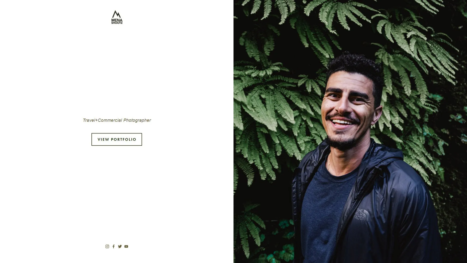
Photographer portrait image on the About page

Speaking of making a photography website trustworthy, I gathered statistics on how many famous photographers include (at least) a portrait image on their About page: 88% of them.
Video on About page

A self-portrait image is the standard, but what about using a video instead?
Only about 1 in 9 popular photographers use a video on the About page, even though it’s an excellent opportunity to show visitors more about who you are and how you work.
Email address on the Contact page

I wasn’t expecting these stats: 44% of popular photographers do NOT include an email address on their websites (including their contact page).
Most of them just rely on a simple contact form or links to their social media profiles, but they’re probably missing out on some inquiries because of this.
While some visitors are OK with filling out a contact form, many prefer using their own email clients to send a message, which requires seeing (or clicking on) an email address.
Email obfuscation on the Contact page

“Email obfuscation” means protecting your site’s email address from being easily scrapped and put on spammy outreach lists.
Using obfuscation techniques is usually done to try to reduce the number of spam emails received in your inbox, ranging from the simple method of spelling out your email address with separators (“first DOT last AT domain DOT com”) to more advanced javascript functions that hide the email address entirely from the source code.
No email “hiding” measures are foolproof, and they also require a bit of coding knowledge, so it’s no wonder that famous photographers don’t have it in place.
By the way, 27% of all reviewed photographer did NOT advertise a professional email address on their domain and instead showed a personal email address on their website (gmail.com, mac.com, etc.)
Phone number on the Contact page

While I consider the email address mandatory, the phone number is optional these days. Unlike email, which is a passive form of communication (you can reply when you have time), the phone is “interruptive,” and you might not want that.
About a third of famous photographers (which get large amounts of website traffic) decided to keep a phone number in the contact information on their websites, either their personal number or their manager or company studio representative.
Contact form on the contact page

While some people prefer clicking on an email address and composing a message in their personal email client, others hate seeing their busy inbox. So, instead, they prefer leaving a quick message directly on the website’s Contact form.
Having a simple contact form is standard web practice, even though a third of popular photography websites miss it.
For more ideas on what to include on your Contact page and how to improve it, check out this detailed guide: The essentials of building an effective photography “Contact” page
By the way: I found out that only 7% of all reviewed websites were missing all three (email, phone, contact form). Maybe they were so popular that they didn’t want to be contacted for any reason at all :-)
5. Photography galleries
Total number of portfolio galleries

When famous photographers showcase their best work on a website, how many galleries do they group them in?
There’s no clear winner here. Some choose only to use one single gallery, just one set of “best-of” images.
And those that do separate images into multiple galleries, 5 seems to be the most common number.
The average number of galleries per website is 10. After removing the “outliers” (with 25+ galleries), the average drops down to 7.
Average number of images per gallery

Portfolio galleries with just 3 images? Sure. What about 335 images? Absolutely. There’s no clear winner, and a simple “average” would show 56 images, but that’s not really accurate.
Instead, as you can see from the chart’s green “trendline,” the sweet spot is around 15-20 images per portfolio gallery.
And that is consistent with PhotoShelter’s survey with photo buyers:

Read more on this topic here: The process of selecting images for a strong & coherent portfolio
Image thumbnail dimensions on gallery pages (in pixels)

This chart shows how large thumbnail images are displayed in gallery grids.
Here’s how I interpret these results:
- outdated websites still show very tiny thumbnails (below 200px)
- some platforms (like PhotoShelter) only allow thumbnail images at 200px (on their Classic templates), or the photographers have just opted to keep them fairly small, so more thumbs fit per row (or per page).
- modern thumbnail grids (with masonry or justified layouts) naturally display larger images (this is the recommended way)
- values above that are probably exceptions (like gallery pages that don’t really load thumbnails, but larger images directly in a slideshow – and that can be ignored here)
Type of thumbnail grid

Speaking of displaying gallery thumbnails, this chart shows a breakdown of the types of image grids used by popular photography websites.
I’m happy to see that justified grids are the most popular ones out there, I highly recommend using them whenever possible.

Check out this past article for an explanation of all five types of image grids: The 4 types of thumbnail grids: what’s the best way to display thumbs on your photography website?
Individual image dimensions (in pixels)

This chart shows the dimensions (in pixels) of the images in portfolio galleries.
Depending on the device screen size, the images might be shrunk/resized by the browser to fit the page, but these are the actual image file dimensions.
Most popular photographers prefer to upload images below 1500 pixels on the longest edge, but there are still plenty of site owners to use larger images around 2000px or more.
The smallest value in a reviewed site: 560 pixels on the long edge.
The largest value: 3200 pixels. While this is considered too large just for portfolio purposes, there were ZERO websites in my list that used high-res images (4000px or above), which is good.
Image filename SEO-friendly format

Surprisingly, many famous photographers don’t care too much about their image filenames. Or, it’s fair to say, their platforms don’t allow custom image filenames.
That means that they end up with “ugly” filenames that include a random code generated by their camera (e.g. DSC012345.jpg) or enforced by their website platform (e.g. d7e2j315knmd32aa4.jpg)
However, more than a third of the reviewed websites did have keyword-rich image filenames (e.g. description-of-image-here.jpg), instead of relying only on ALT tags to “talk” to Google.
Image watermarks

A whopping 93% of popular photographers DON’T watermark the images on their websites.
Here’s how I would make sense of this stat: they would instead protect their images by only uploading photos at the correct pixels dimensions, instead of “obstructing” them with a watermark or overlay. They are “image purists” :-)
And it proves that you don’t really need to watermark your images for branding purposes either. You can be popular even with (or because of) NOT watermarking your images.
Image right-click protection

Speaking of image security, only a third of popular photography websites have any protection against right-clicking on images (to save them on your computer).
And out of those that do, about half run on WordPress (which has plenty of plugins for this job).
Ability to enlarge thumbnail images in a lightbox view

Some photography websites (31% of reviewed sites) prefer to display images as medium-sized thumbnails or in a slideshow, without any way to click to enlarge them. This leads to poor user experience, especially on desktop screens, where viewing larger images is more impressive.
But the majority of popular photography sites does have a lightbox feature, allowing visitors to view full-screen images and to navigate between them easily:

6. Blogging
Photography blog

Almost 70% of all famous photography websites have a dedicated blog area, which is quite an impressive number.
But after looking more closely, a quarter of those are abandoned blogs (they’ve not been updated in 2+ years!)
Combining those two stats tells us that precisely 50% of all famous photographers have an active blog area on their website!
To learn more about how to start your own photography blog, and generate writing ideas, check out my complete blogging course for photographers.
Blog on the same domain as the main site

Out of those websites with a photography blog, 88% are correctly placed on the same domain as the main website, so they’re tightly integrated.
That’s the ideal scenario for SEO as well: placing your blog in a “sub-folder” has SEO advantages over having it in a “sub-domain” or a completely separate domain.

Number of blog posts

Notice that the number of posts expressed in this chart are grouped exponentially, not linearly:
- first, you have blogs with 10 posts or fewer
- then you have established blogs with up to 100 posts
- then you have seasoned bloggers with up to 1000 posts in their archive
- and finally, you have the outliers: blogs with a massive backlog of 10+ years worth of articles (one website had 9350 posts at the time of my review)
Number of blog post categories

Almost have of photography blogs don’t use categories (which is the same as saying they only have a single one called “Uncategorized”).
And those that do, the sweet spot appears to be between 4 and 6 categories for organizing the blog posts.
But there are exceptions. Of course, there are :-) One photographer had 139 different categories (to organize their 6550 blog posts).
Blog template matching the design of the rest of the site

Do you know how you sometimes visit a photography website, click on “Blog” in the navigation menu, and end up on what feels like a completely different website?
Apparently, this doesn’t happen too often on famous photography websites, with 90% of them (out of those that do have a blog in the first place, of course) properly integrating their blog design into the rest of their site.
7. SEO
Website has custom SEO titles and meta-descriptions

Considered the “minimum” of any on-site SEO efforts, writing custom SEO tags is the first step in controlling how Google understands your website.
Yet, a third of popular photography websites don’t have any SEO title or meta-description (for the homepage and other main site pages), leaving Google to rely on pseudo-random text from the page to display in search results.
Website uses pretty permalinks

Pretty permalinks are SEO-friendly URLs (or “slugs”), e.g. http://www.janedoe.com/galleries/location/amazing-image/
Almost all popular photography websites have them, but there are a few sites that still have ugly permalinks (out of negligence or caused by their chosen website platform), e.g., http://www.janedoe.com/index.php?cat=183&mode=ugly&var=264a2qw7zaa
Website pages have H1/H2/H3 heading tags

Another big staple in on-site SEO, heading tags are not used by almost half of popular photography websites out there.
Without SEO titles and heading tags to “tell” Google what a page’s topic is, the small body copy can’t do all the SEO heavy-lifting.
This lack of heading tags usually happens out of negligence (or lack of SEO knowledge), with photographers just using their page builders to put together some text and increasing the font size when needed, instead of using the correct H1, H2, H3 HTML tags.
Images with ALT tags

With how much photographers are usually obsessed with SEO, I was very surprised to see that 77% of popular photo websites don’t have image ALT tags.
I put this down to a couple of reasons:
- Lack of SEO knowledge
- Unwillingness to put in this kind of time and effort. And this last bit is understandable: writing unique ALT tags to describe each of your photos can be a grueling task, taking many hours depending on the size of your portfolio.
Just copy-pasting the same ALT text among multiple images to try to “check another box” is not really the right solution. Google hates seeing repeated content.
So it becomes a compromise: to get some more SEO juice out of your website, without 100% certainty in results and timelines, photographers need to spend time at the computer to write custom ALT tags for their images. And this trade-off is subjective.
Google MyBusiness listing

When selling photography services, especially at a fixed studio/location, it’s important to show up as high as possible in Google Search results.
And what’s better than position 1?
Position ZERO = showing up in Google Maps cards or large Google MyBusiness listings to the side of search results:
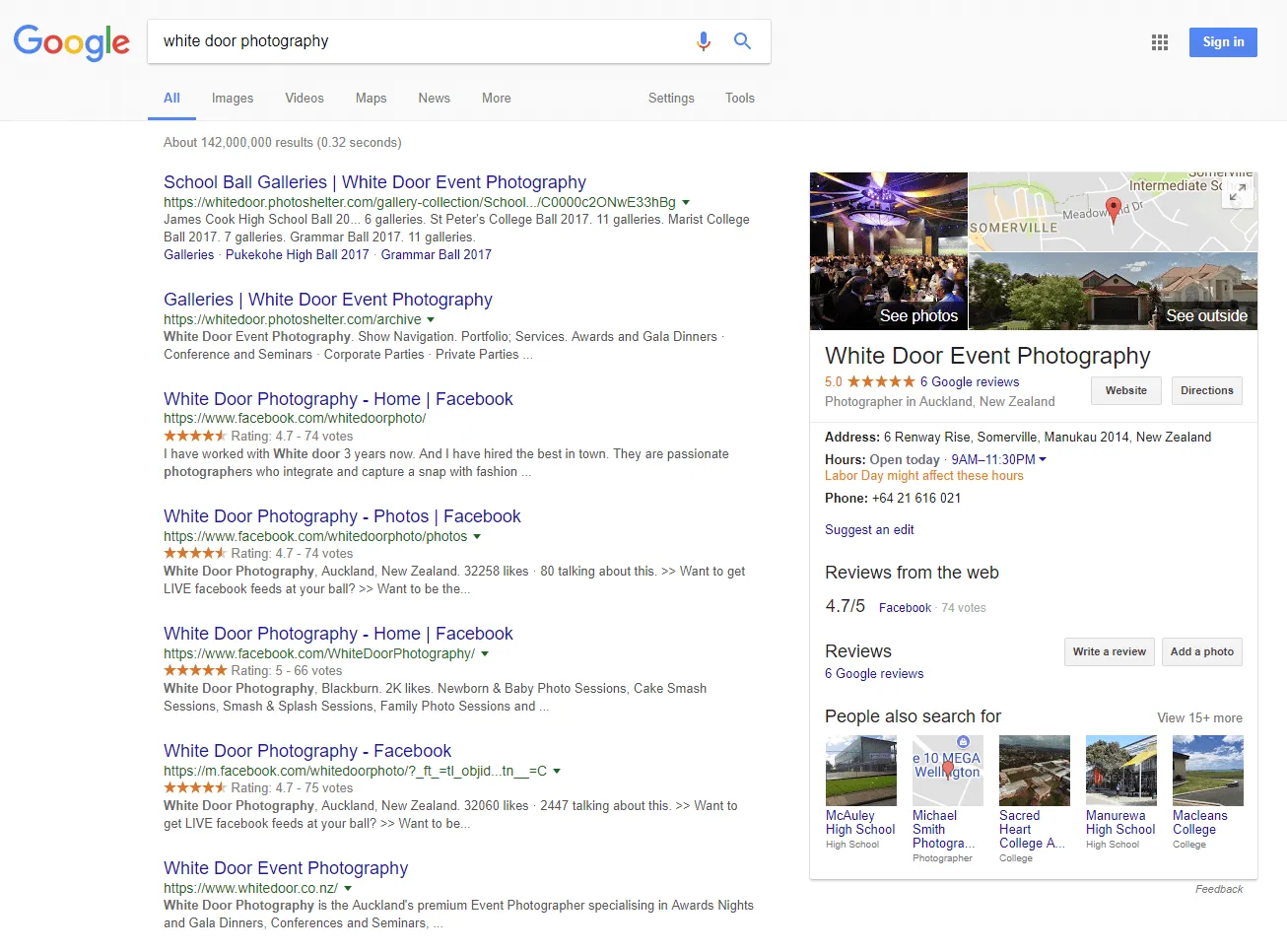
Based on my research, only about a third of popular photographers leverage this tool. And it’s safe to say that many of the ones that don’t use Google MyBusiness are also traveling a lot or are unwilling to be found “on a map.”
Number of backlinks pointing to the website

I used multiple backlink-checker tools (which give different numbers) and averaged them to come up with these numbers.
While they’re not an exact science, they can at least give you an idea of the order of magnitude of links that these popular websites get from other places on the Internet.
You have everything from sites with just 2 backlinks to sites with more than a million backlinks!
You might be thinking: how can some popular photographers with so many social media followers have so few links pointing back to their sites? It’s possible that they recently changed their websites or domain names without caring for a proper “SEO transition”.
I intentionally grouped the results in logarithmic “buckets.” Otherwise, the linear chart would have looked like this :-)

8. Performance & mobile-friendliness
Website speed (Google PageSpeed Insights scores)

When testing all of these popular photography websites in Google PageSpeed Insights, the results are… well… quite “average”, with more than half of them falling into that category.
However, a respectable 29% of websites were considered “Fast” (with scores of 90 or more), showing that some top photographers have put in the effort to optimize their website performance properly.
When checking the mobile scores (which is considerably stricter because page load delays are more noticeable on phones and tablets), results become worse:

On mobile devices, more than half of the reviewed websites become “slow,” while only 6% of them still merit the “fast” badge of honor.
With many photographers reporting that more than half of their traffic is coming from mobile devices, it’s even more important to optimize and test your website with a mobile-first mindset properly.
Website mobile-friendly (Google Mobile-Friendly Test)

Ignoring a handful for seemingly-abandoned websites, most popular photography sites adapt well to smaller screens, either by using a responsive template (with mobile & tablet breakpoints) or completely fluid themes (that “reflow” the content layout to any possible device screen size).
Good to see the photography website industry being healthy in this department.
Don’t forget that mobile-friendliness is not binary; there are multiple levels of friendliness.
9. eCommerce
Selling images on the website

When it comes to selling images directly on their websites, 32% of famous photographers are actually selling photos directly: 30% prints only, 2% licenses only, 2% both prints and licenses.
The rest have no directly image-selling options, but they might sell other types of products, as explained in the next chart.
By “prints,” I’m referring to selling individual prints (including “limited edition prints” or “signed prints”), wall art, posters, photo albums.
Selling other types of products

Besides prints and licenses/downloads, about half of popular photographers sell various types of products on their websites.
A few definitions are needed here:
- “Selling products” = selling any physical or digital product that’s sold once, or selling access to photo tours or online education. It does not include selling photography services.
- “Workshops” = photo workshops & photography tours, 1-to-1 mentoring, online training events, “headshot marathons”
- “Books” = physical books, eBooks, magazines
- “Courses” = online courses and educational products, real-life training courses, “photography university”, tutorials, online community, speaking events
- “Presets” = Adobe Lightroom presets, Photoshop actions
- “Merch” = branded clothes, stickers, pins, and custom prints
- “Gift cards” = vouchers and online gift cards
- “Software” = photo editing software (example)
- “Calendar” = branded desk or wall calendars
- “Gear” = camera straps and cases
10. Social media & newsletters
Social media profiles

When it comes to the use of social media sites, Instagram and Facebook are the clear winners, both being used by more than 90% of the most famous photographers in the world.
Twitter is quite popular, too, at 75%, then followed by YouTube and Pinterest.
For video platforms, YouTube was the clear winner, with Vimeo only being used by one single photographer in my research.

So why are all these photographers considered “popular”?
Almost all of them have more than 100.000 followers on at least one big social media platform.
Not necessarily all of them. Being popular on Instagram doesn’t mean they have a massive following on Facebook too. For example, one photographer had just 144 Twitter followers, but around 150.000 Instagram followers. Or another photographer had “only” 19K Instagram followers, but more than 1 million Facebook fans.
By looking closely at the chart, you can see that Instagram is the “king” of social media sites for top photographers, taking the top spot in “number of photographers” in all categories above 10K followers. Once again, Facebook comes in second, and then Twitter.
Sorry, LinkedIn was not tracked in this research study.
Photography newsletter

Besides social media profiles, only 38% of top photographers have mailing lists.
Running a newsletter is a lot of work, and it can be slow to get meaningful results. But once you get it going, and you have hundreds or thousands of people regularly getting your updates in their inbox, it’s an excellent way to get inquiries and grow your business.
Plus, an email list is something you control (and that you can migrate to a different mailing list service if needed), unlike social media followers who don’t really “belong to you.” Social media sites are known to change the rules (and ask you to pay to get in front of your followers) or become too “busy” or “messy” (I’m talking about you, Facebook…).
Check out point 8 in my guide on How to modernize your photography website for an overview of how to start a photography newsletter.
Here are social media followers stats for photographers with or without a newsletter to reinforce how useful a newsletter is.

Except for YouTube, photographers showed increased follower numbers on all social media sites if they also had a mailing list. We cannot infer causality here, but it’s still a useful correlation, a sign that newsletters are indeed useful business tools you should leverage.
Conclusions
When doing this research, I was negatively surprised to see how many of these popular photographers had really bad, awful websites!
A long time ago, I wrote a big list of 60+ mistakes that photographers make on their websites, and… well… I think I encountered most of them in this research study:
- broken internal pages (or complete sections of websites) and broken external links
- annoying intro/splash pages (sometimes with animations) blocking users from using the site in any way
- a complete mess with SEO tags (they were sometimes either missing or copy-pasted among all pages, or, even worse, with spammy lists of comma-separated keywords)
- ugly designs with outdated layouts and poor typography
- sites that…, although technically mobile-friendly, had a terrible mobile user-experience or were incredibly slow to load (e.g., a website homepage that loaded 64 full-res images one below the other in a very long scroll)
- and generally, a lot of unpolished details. When doing these website reviews, too often did I have to write down in my notes: “Great images, crappy site.”
That’s why this report is mostly a list of “what not to do” to have a great website.
And it also shows that the quality of your images matters most! The website is just a multiplier of your work, but it’s not the main reason why some photographers end up becoming popular or successful (because these are sometimes different).
Methodology
The initial list of the 100 photographers was built using many “influencer” discovery tools, social media sites (tracking follower stats from Facebook, Twitter, Instagram, LinkedIn, Pinterest), and various “top photographer” roundups online.
Websites chosen were not filtered in any way (by photo specialty, photographer gender, or any other criteria) to avoid biases or personal preferences. A few sites did get excluded for various reasons (site not updated in 10+ years, involved in plagiarism or controversy, or the site did not belong to an individual photographer but a foundation or a team/company). This research project is NOT sponsored by or associated in any way with other companies.
A full list of photography websites that made the cut is available here.
Not included in this list? Don’t take it personally, your site simply didn’t come up in the social media posts or “top photographers” roundups I found online at the time of doing this research. No harm done. Feel free to get in touch nonetheless, and I’d be happy to take a quick look at your website or even do a detailed review.
All websites were then manually reviewed by me (Alex Vita), by painstakingly looking at over 80 technical details for each website (design, content, SEO, etc.). Oh yes, imagine the size of that spreadsheet! :-)
Since I’m just a one-person business, this entire research project spanned around 6-7 months in total, with the graphs and conclusions in this report requiring an additional few months to put together.
It was a labor of love, and I hope you learn something from it and improve your own website as a result.
Known limitations
For full transparency and honesty, I’m acknowledging some possible limitation with such a website research project:
- there is no objective measure of what makes a photographer successful. Audience or website traffic size are measurable values, so they were used as proxies to gather the list of websites here, but
- they’re not always relevant. “Success” (as is “happiness”) is subjective and personal. Dedicated and well-positioned photographers might be better examples to emulate in your business, even if they have smaller audiences than some of the “influencers” studied here.
- some websites are completely outdated (aka “ghost towns”), and their website owners know that. I don’t know the site owners’ business goals, maybe they just want a presentation website and don’t care about SEO-based organic traffic, or perhaps they just moved on to other ventures.
- while I will try to refresh all of this report data yearly, websites change over time. They can get updated/improved or get put offline by their owners, making some of this data invalid. Look for general guidelines and common themes instead of focusing too closely on the actual percentages.
Want a detailed review of your own photography website?
Do you want to see how your site stacks up to these ones?
Get a professional review of your photo website to get a clear idea of what you need to improve, or explore my other web-design services for photographers.