Are you wondering why you’re not ranking well on Google, or why users are not taking action on your site? Website speed is a critical user-experience and SEO factor (affecting bounce rates and rankings), and image sizes often are the overwhelming performance bottleneck.
Contents
I have over 10 years of experience building photography websites, and I routinely have to find the right balance between creating an impressive visual impact and still crafting a fast & user-friendly website experience.
In this detailed guide, I’ll teach you everything you need to know about sizing and compressing images before uploading them to your website, what tools to use, how to test your site’s speed, and much more.
You’ll find straightforward and actionable tips on how to optimize images for the web and how to improve your site’s performance scores quickly, with tons of examples and resources, and a comprehensive FAQ at the end.
This guide is written with photographers in mind but applies to any responsible website owner looking to improve their website’s load times.
Why care about website image sizes & performance?
People expect websites to be really fast. Google does too.
However, most top photography websites out there are slow:

Website performance has become an essential SEO and user-experience factor in recent years, as connection speeds have greatly improved. Any long delays in page load times might cause your website’s visitors to lose interest and leave.
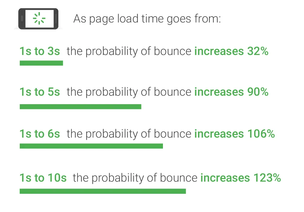
And with half of your visitors likely using a mobile device, delivering optimal image file formats & sizes is critical. Otherwise, your hard-earned traffic decreases, and your Google rankings eventually drop too.

How do you know if your website has image-related performance problems?
Simply test your site with free tools like Google PageSpeed Insights or GTMetrix or Page Weight by imgIX, and you’ll probably see issues like these:
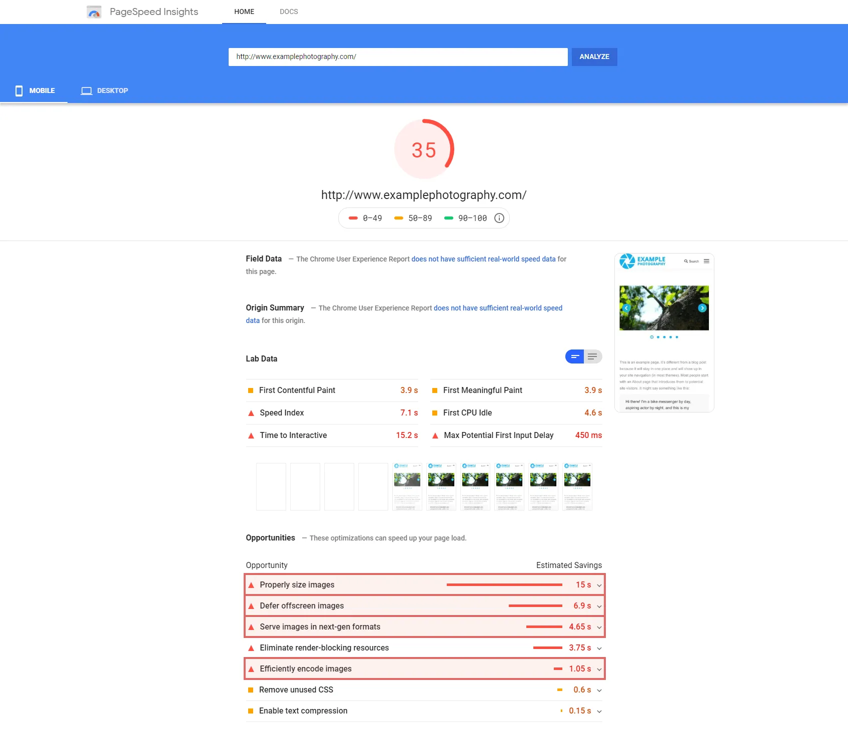
Follow this guide for detailed instructions on how to fix those performance issues. Part 4 explicitly covers all the image-related page speed “opportunities” listed in Google PageSpeed Insights.
So if you care about your site performance (and, in turn, its SEO), you need to control your website image size.

Lowering image file sizes while maintaining acceptable quality is the primary goal of optimizing images for website performance. Smaller files lead to faster page loads and improved user-experience & SEO.
But how should you resize and compress your photos before uploading them to your site? How can you automate this process? And what file formats should you use?
Let’s deconstruct the 3 main image size guidelines for reducing file sizes (without sacrificing quality too much, of course):
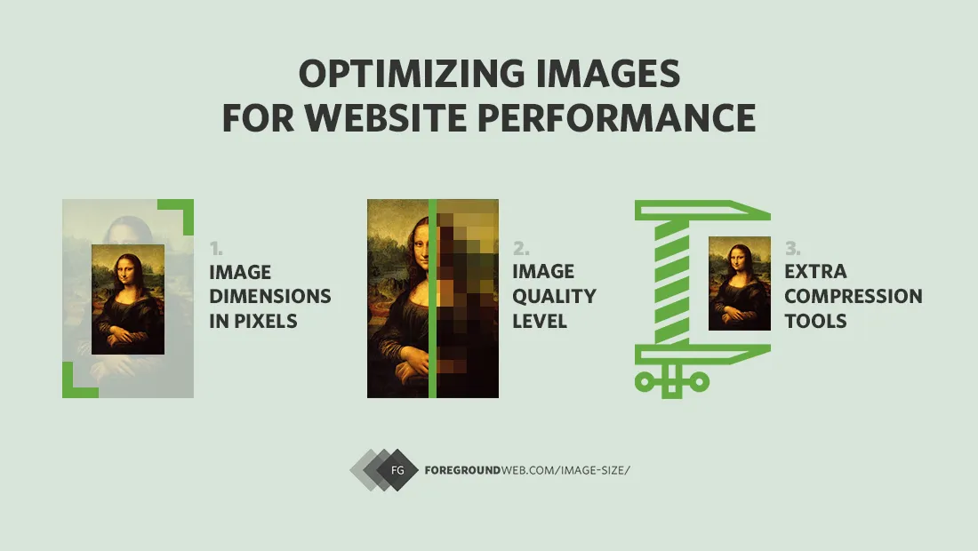
1. Best image sizes for websites (dimensions in pixels)
It all starts with finding out the right image dimensions needed for your pages, to help you better prepare them on your computer first. Uploading large images to your site, without regard to the actual size they’re being used at, is what causes huge performance issues.
Here are detailed website image size guidelines (updated for 2023).
But first, regardless of file formats (JPG, PNG, GIF, TIF, etc.), you should never upload high-resolution images to your site just for display purposes.
Even if your website is only displaying them at a smaller size, the URL for the original images can often be reverse-engineered from the source code, and your images can get stolen. Plus, large images take a lot more time to upload and are slower to optimize.
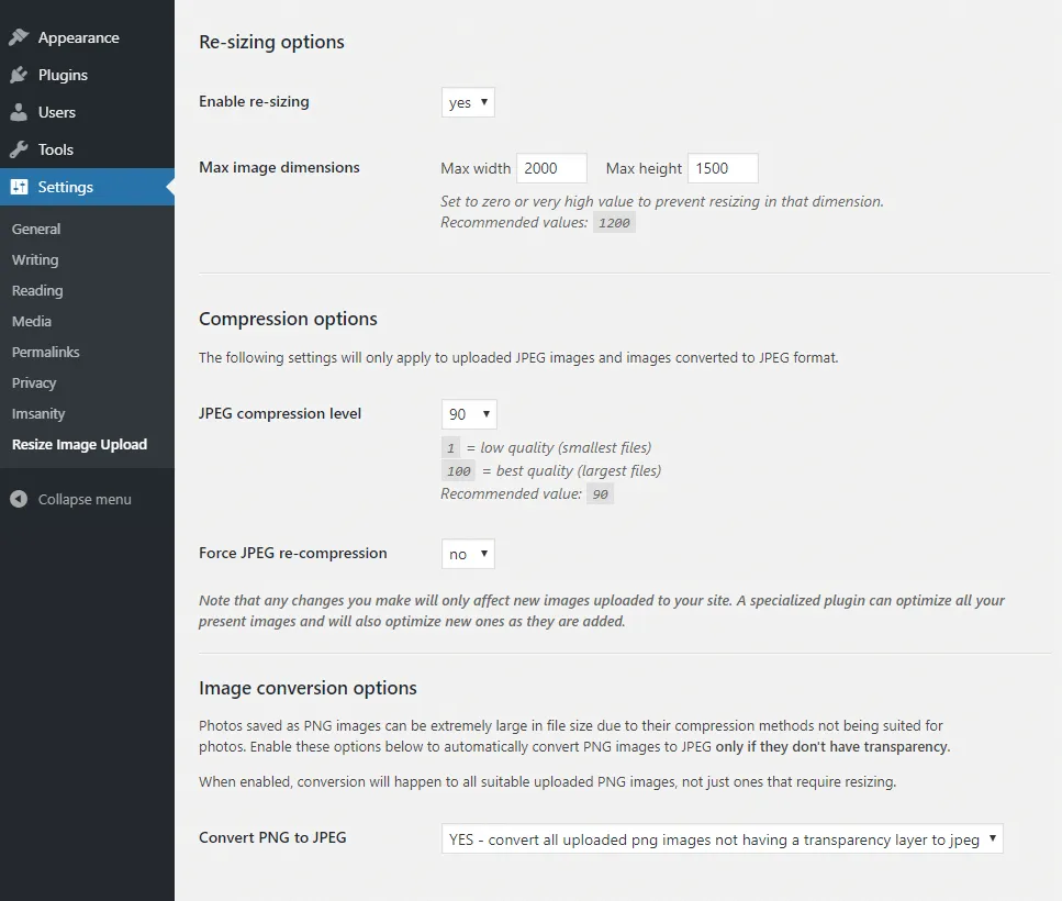
At the very least, use a plugin like Resize Image After Upload or Imsanity (if using WordPress) to take care of resizing for you, and also do a bulk resize of all your previously uploaded images while you’re at it.
The only exception is if you’re using a secure photography-specific platform which also allows selling prints & image licenses (like PhotoShelter or SmugMug).
These services need the highest image size you have to allow printing at larger sizes and good-enough quality. Also, these platforms prevent image theft by automatically resizing images to a smaller size when displayed on the web.
Otherwise, if you’re only displaying images in a portfolio or a blog post, never use images at their maximum dimensions.
What do you mean by “image size”?
By “image size”, we’re referring to the image pixel dimensions (width and height in pixels), or the image file size (KB or MB).
But we are NOT referring to the image size in inches/cm or to the image DPI. On the web, DPI is irrelevant and only pixel dimensions matter!
How to determine the correct image dimensions for your website
For optimal website performance, images should be as large as needed to fill their “containers”, based on your page layout. For example, slideshow images are usually wider; blog images are medium-sized (at a width equal to the page width minus the sidebar); thumbnails are smaller, etc.
So it’s crucial to determine image dimensions first, to know how wide your content area is on your site. You can use a “page ruler” browser extension that helps you take the measurements, or if you have experience, use the developer tools built into your web browser: right-click on any page element and click “Inspect”

Here are instructions for finding the element selector in other browsers.
Then use the element selector tool in the toolbar and hover over the image or content area you’re interested in:


In this example, the column above needs an image of at least 585 pixels in width.
I say “at least” because images probably need to be larger than that to account for high-density “retina” screens in modern devices, so they look extra sharp.
Let’s consider a few scenarios:
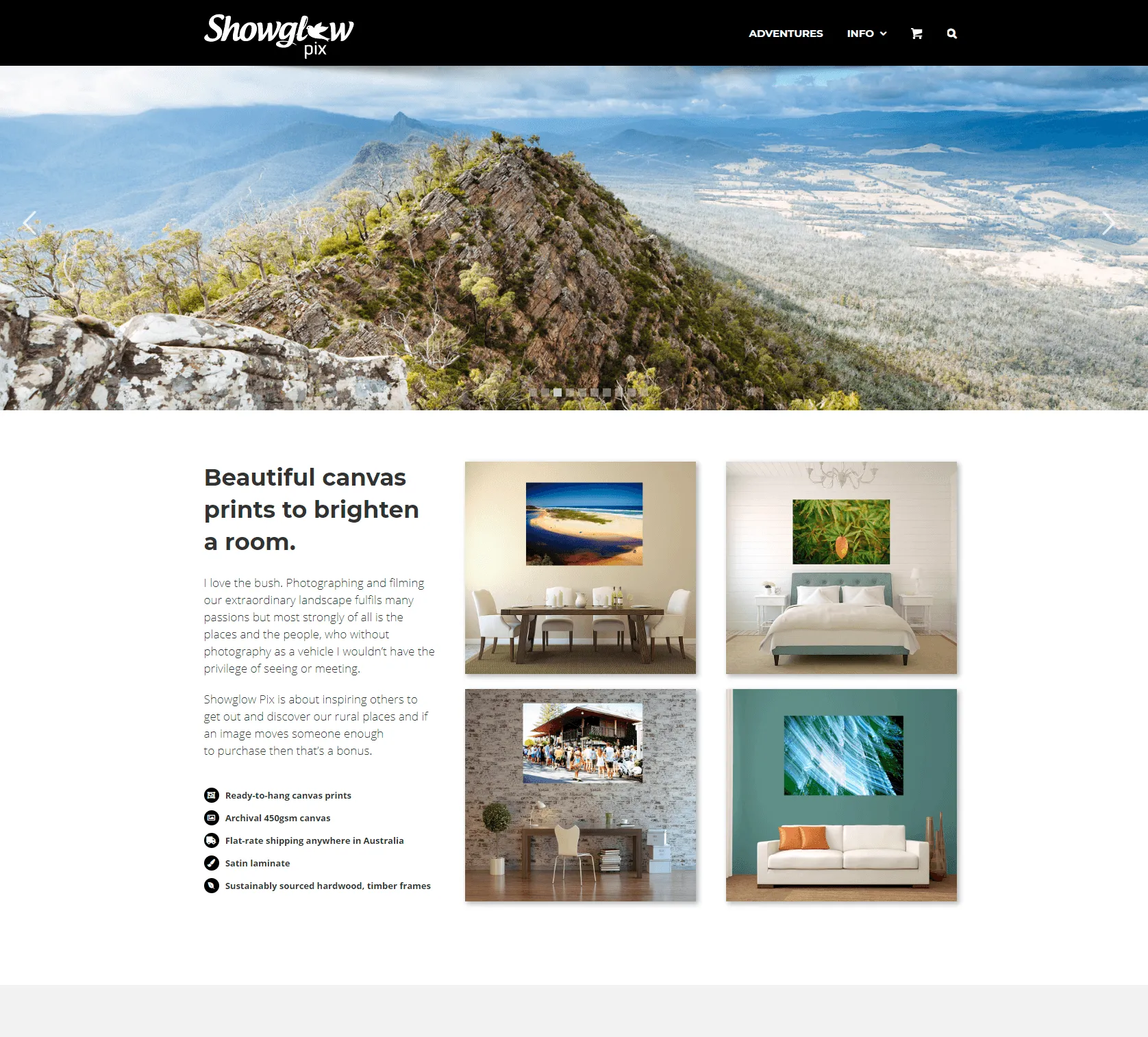
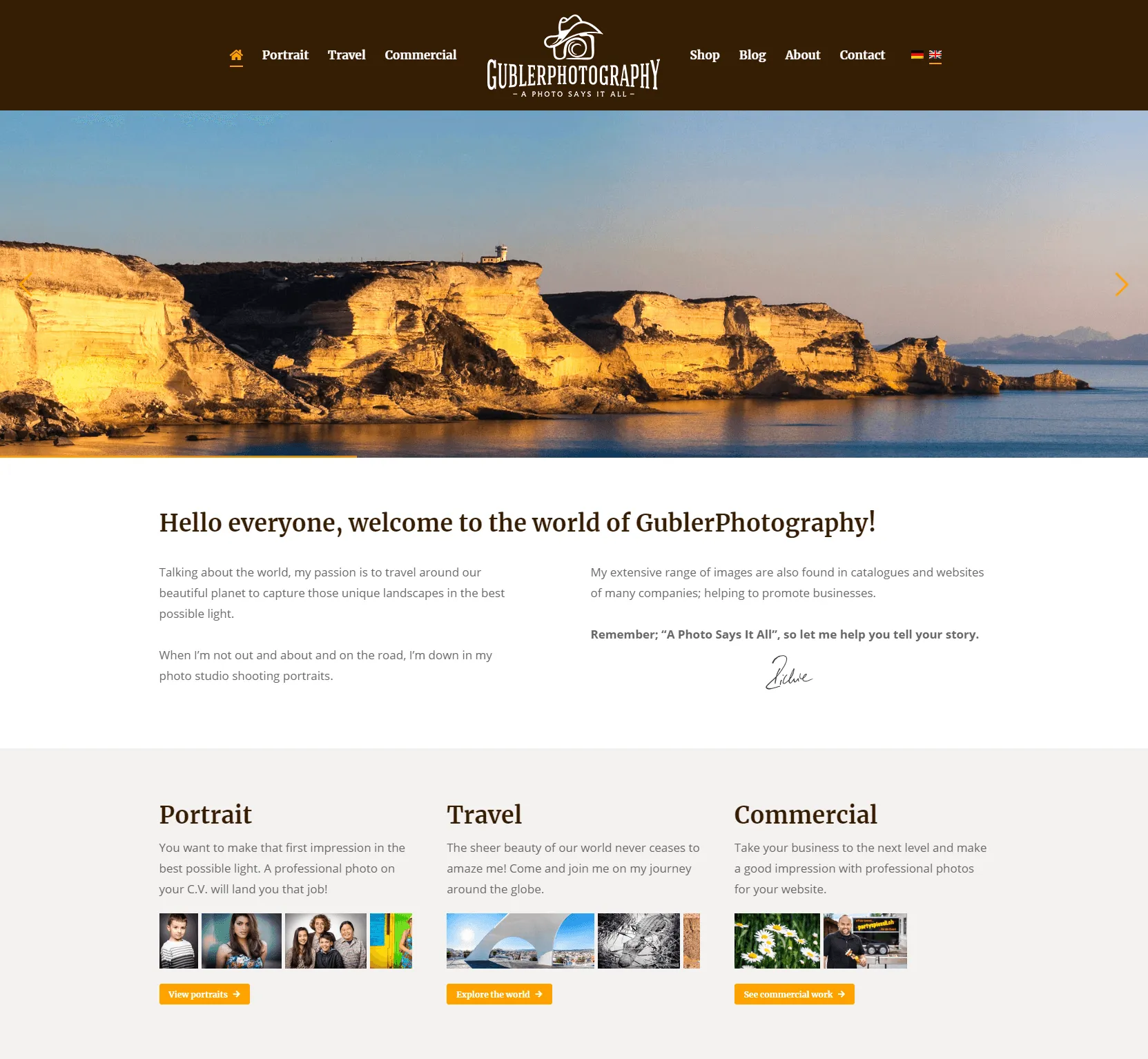
a) Best image sizes for full-width slideshows
For full-width slideshows (that automatically stretch to the full size of the browser), I recommend going for 2560 pixels in width, which is the standard resolution width for 27″ and 30″ monitors.
Images can have any height you need, to create an aspect ratio you’re comfortable with. For example, full-page slideshows that are popular on wedding photography sites keep the original aspect ratio of images. Other sites use a slideshow that still takes the entire width of the page, but that’s shorter in height (leading to an aspect ratio of around 3:1)
Here are examples of such “panoramic” slideshows from photography websites:
By the way, please reconsider using a homepage slideshow in the first place.
So for any images that span the entire width of the browser, images should be 2560 pixels in width, and any height you prefer (depending on whether you want to keep the original aspect ratio of your photos or go for a more panoramic crop).
Use 2500px if you want a round number :-)

This is not a scenario where we need to double the image dimensions for retina screens, because that would create huge 5000px images (with large file sizes as well, not to mention the risks of image theft).
For smaller slideshows that don’t take up the entire width of the page, but maybe just a percentage of it, adjust the required image size accordingly (maybe 2000px, or 1800px, etc.)
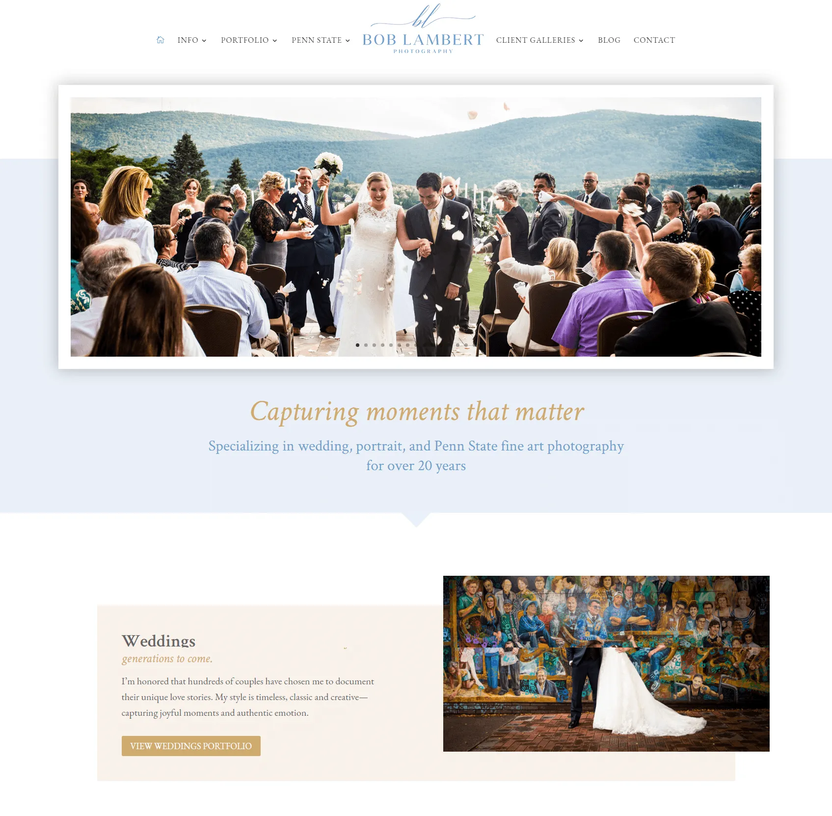
b) Best website gallery image sizes (and thumbnails that enlarge in a lightbox view)
Thumbnail galleries are special scenarios where you ignore the size of your thumbnails, and instead, make sure images are large enough when enlarged.
By “lightbox view”, I’m referring to a grid of thumbnail images that, when clicked on, open up in a full-screen slideshow (usually with a semi-transparent overlay underneath):

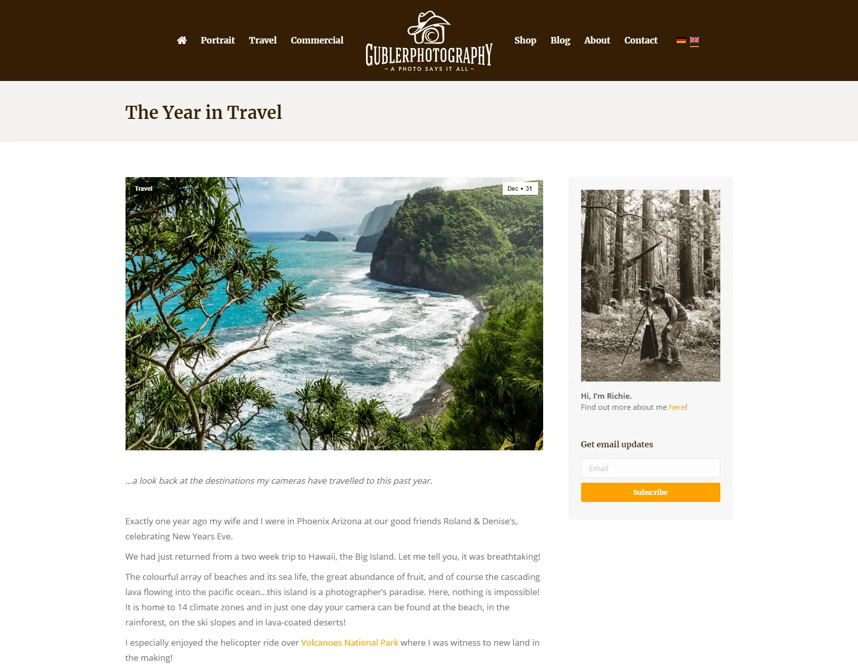
Since those images will open up in a full-screen view, I recommend sizing them to at least 1500 pixels (on the longest edge), so they look large enough on desktop and tablets.
You can even take them up to 2000 pixels if you want, for some extra “wow factor”, but usually not more than that.
On mobile devices, images get resized by the browser anyway, and that 1500px size is enough to look crisp on smartphones with high-PPI “retina” screens too.
Vertical/portrait images can be even smaller, with a maximum height of 1200px (like 800×1200 pixels for a 2:3 vertical image, or 900×1200 pixels for a 3:4 vertical image).
Restricting the image dimensions like this will keep the file size reasonably small, resulting in a faster image loads (if the slideshow allows navigating between images using side arrows, bullets, swiping on mobile or keyboard arrows on desktop):

One important technical aspect here: your website theme/template should ideally be smart enough to use smaller-sized images for the thumbnails, and their higher-sized versions for the lightbox mode.
Notice how this site’s theme uses the full-scale image in the link (which gets used when opened in the lightbox view/slideshow), and smaller sized image files for smaller screens at different breakpoints.
Choosing a quality WordPress theme can do all this for you.
c). Best sizes for blog images or other static images used in page layouts
Assuming that your blog images don’t need a click-to-enlarge (aka “lightbox”) capability, images should be sized depending on the width of that column or content area.
Let’s take an individual blog post example:
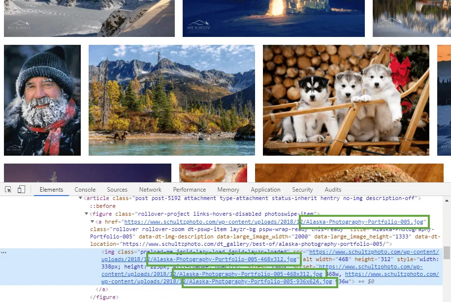
Using the methods described above, you can determine the actual width of the content area by measuring any paragraph of text, for example:

Or if you already have images, you can determine what size they’re being resized to by the browser:

Alternatively, you could use a browser extension like View Image Info (properties) to get that same info:

Armed with that knowledge (825 pixels in this example), you can now double that size to take into account retina screens (so 1650 pixels in width here).
Depending on your specific site theme, and your image theft risk-tolerance :-), you can lower that number down to a more reasonable 1200 pixels on the longest edge (so 1200px in width for horizontal images, or 1200px in height for vertical ones, maintaining their original aspect ratio of course).
The same decision-making applies to smaller images used as thumbnails (which don’t need to be enlarged).
For example, your site might display some thumbnails as your “Featured galleries”:

Knowing that they get displayed at 260×174 pixels in width based on your page layout, you’d upload images at twice that size: 520×348 pixels.
Once you’ve figured out what pixel dimensions your images should have, you can start preparing them in your photo editing software of choice. Which leads us to the second most important aspect…
2. Best image file types, quality & compression levels
a) Exporting & compressing JPG images
Regardless of the photo editing software that you’re using, you almost never need to export images at 100% (in the quality slider). Choosing something like 60 or 70 gives you good-enough quality for much smaller file sizes (sometimes you can see a 5:1 reduction in file size without any perceived quality loss).

I recommend NOT using Lightroom’s “Limit file size to…” option instead of the quality slider, because you could end up with some very pixelated images, because of how the JPG algorithm works.
Photos with more color and finer details (like trees/foliage) often naturally have larger file sizes, and setting a hard limit can result in over-compression.
Use this option only when you truly know what you’re doing.
Only when you start to go lower than 50-60%, do you start getting visible artifacts due to the high file compression. But between 100 and 70-80, the quality difference is unnoticeable, while the difference in image file size is enormous.
For best results, experiment with various quality settings for your images, and don’t be afraid to dial down the quality – the visual results are often very good and the filesize savings can be quite large.
(source: Google Web Fundamentals – Image Optimization)
Here’s a simple experiment I did with exporting an image at different quality levels:

A similar principle applies if you’re exporting images from Adobe Photoshop.
If you’re using the latest version of Photoshop CC, be sure to use their new export dialog under File > Export > Export As…
That usually outputs better results than using File > Export > Save for Web (Legacy), and definitely better than using File > Save As…

Then do some experimenting and choose a compression level that you’re comfortable with.
When comparing images (100% quality vs. 60% quality, for example), don’t forget to preview them at the dimensions at which they’ll show up on your site. The goal is not to compare zoomed-in 1:1 previews of high-res files (where you’re more likely to notice JPG artifacts), but to compare images at “realistic” pixel dimensions (which usually look sharper and without any meaningful visual differences).
Once again, most people find 60% – 70% an acceptable compromise between image quality and file size.

Most photographers will know that images with gradients pose a big problem here (walls, skies, background colors). At low compression levels, you can start to see the lines in the gradients (aka “banding”), a sign that you need to raise the quality (to 80-90%).
In the end, the images on your site should not go beyond 500 KB (= 0.5 MB) in file size.
And always save JPG images in the sRGB color profile, which is what most browsers understand, to avoid any image color integrity issues.
b) Using PNG/GIF/SVG file types for graphics with solid colors
Besides your photographic work, your website likely contains various other graphical elements: logos, small icons, banners, separators, video thumbnails, etc.
Instead of using JPG, any graphics that contain areas of solid color (created by you in Photoshop or other tools online) could be better saved in other lossless file formats (with absolutely no perceived visual differences). PNG, SVG, and GIF formats can work well in such cases.

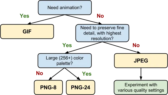 Simple image format decision tree (source)
While PNG and GIF file formats are quite popular, SVG is somewhat of a mystery for most photographers.
SVG, which stands for “Scalable Vector Graphics”, is actually a text file that describes lines, curves, shapes and colors in a language called “XML”.
Without relying on a pixel-grid, SVG files have the great benefit of being infinitely scalable without any loss in quality. And because they’re text-based, they usually have smaller file sizes, and they can be manipulated with CSS code.

Good SVG usage scenarios are: logos, icons, illustrations, drawings, etc.
You can generate SVG files using Adobe Photoshop or Illustrator.
“Finally, once you’ve determined the optimal image format and its settings for each of your assets, consider testing additional variants encoded in WebP, JPEG2000 and JPEG XR. Both of these formats are new, and unfortunately are not (yet) universally supported by all browsers, but they can nonetheless provide significant savings for newer clients – for example, on average, WebP delivers a 30% filesize decrease over a comparable JPEG image.” (source)
WebP appears to be the “winning” image file format of the future, and many optimization plugins (listed below) have started supporting it: they can help you automatically generate WebP versions of your images and then automatically deliver them to compatible devices.
Let’s take one of the graphics I used above as an example:

You have to test this out yourself, on a per-image basis. Always try to use lossless file formats (like PNG or GIF) when you can get smaller file sizes. But like I said, this only holds true for graphics with solid colors. Whenever you try this same experiment with a regular photo (taken with your camera), JPG usually wins (by a lot).

3. Optimizing images for websites using extra photo compression tools & plugins
OK, so you’re ready to upload images to your website.
Even if you correctly set the right pixel dimensions and compression levels when exporting your images (using Photoshop or Lightroom, for example), the following tools can take image optimization to the next level.
It’s important to note here that you don’t necessarily have to compromise on quality here, you can set these extra tools to perform a “lossless” optimization.
Let’s take this quote I once received from a photographer on this topic:
“If the images out of the processing software (e.g. Lightroom) are already down to their lowest acceptable compression visually, I found using plugin reduces file size but also reduces the noticeable visual quality. I’d rather sacrifice kb size and keep visual appeal.”
But even when going for a lossless compression type, where the results are pixel-identical to your original images, these tools can reduce file sizes as much as possible, along with many other useful features that help make your website faster.
It comes down to personal preference: choose the compression level that best suits your workflow and your goals for the website.
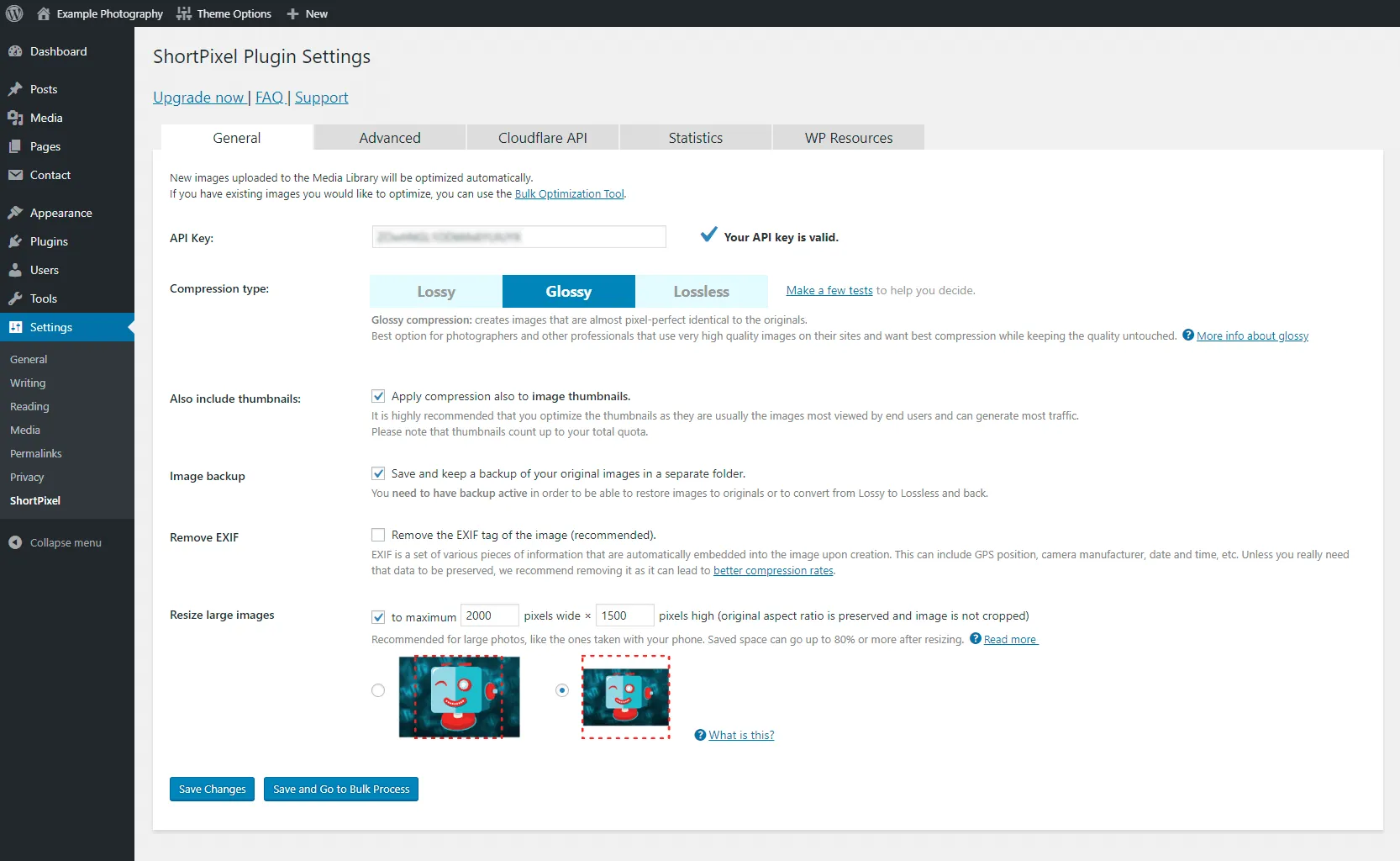
Here are the 3 compression options available in the ShortPixel plugin:
Similarly, Imagify has the following compression levels to choose from:

Image optimization is both an art and a science: an art because there is no one definitive answer for how to best compress an individual image, and a science because there are well-developed techniques and algorithms that can help significantly reduce the size of an image.
(source: Google Web Fundamentals – Image Optimization)
Let’s explore some tools you can use to optimize images for the web:
a) WordPress plugins for image compression
If using WordPress, you’re in luck. There are a bunch of great plugins that do a lot of work for you, automatically. They take every image you upload and then compress it to optimize the file size.
Here are some popular image optimization WordPress plugins:
- ShortPixel (my current recommendation)
- Imagify (no longer has one-time credits, unfortunately)
- Smush Image Compression and Optimization
- EWWW Image Optimizer
- Kraken
- Robin Image Optimizer
- Optimole
- Optimus (limited to 100 KB images in the free version)
- ImageRecycle
- Optimizilla
Out of all of them, I currently recommend ShortPixel for their great features & customer support:
A free account with them gives you a decent monthly quota, and you can get a premium plan to allow optimizing many more images per month if you need to.
Here’s a video I created on how to configure the ShortPixel plugin settings:
You can also pay a one-time fee to get a bunch of one-time image optimization credits (useful when using their bulk optimizer to go through your existing Media Library).
In this case, make sure you properly configure the plugin settings to only choose the thumbnail sizes that matter to your site. Otherwise, those one-time set of credits will go by really fast.
In fact, it’s a good idea to set the right image sizes first (under Settings > Media) based on your website template width, or on your blog layout/width):
- set the “thumbnail” size to however large needed by image grids on your site
- set the “large” size to the width of your content area in a default page template (usually 1200-1300px)
- and set the “medium” size to be somewhere in the middle
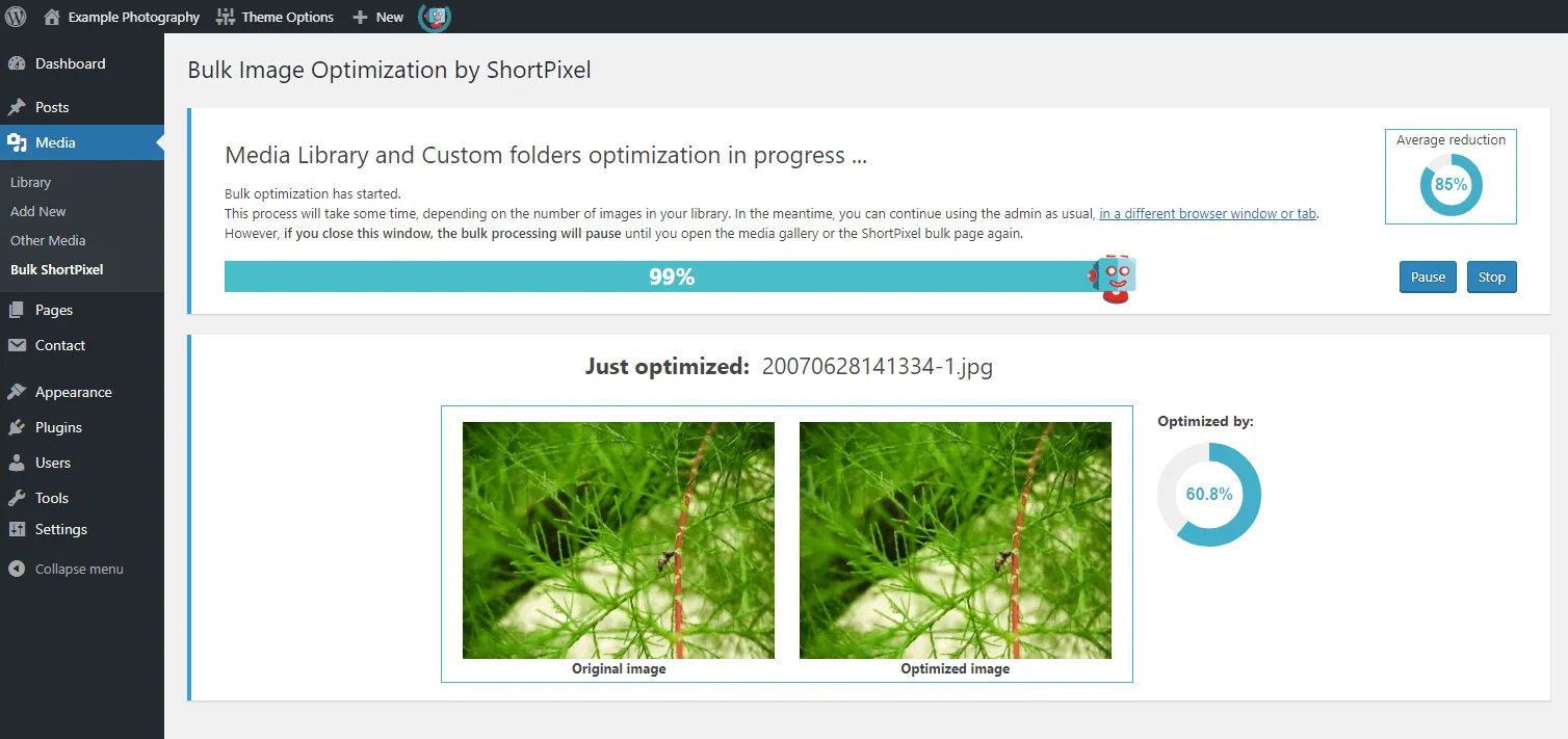
Then regenerate all past thumbnails, and then, finally, do a bulk optimization of your entire Media Library.
Shortpixel’s “glossy” optimization offers a good compromise between image quality and file size, but you can switch to the “lossy” or “lossless” optimization levels as you see fit.
If you can, I recommend bulk-optimizing all your past images (from the WordPress media library):
Here’s how ShortPixel stacks up against Imagify, Ewww and other image optimization tools.
More useful WP plugins here:

Need help managing your WordPress site?
Save time & money by protecting your website, and having me do ongoing testing, maintenance, prevention & iterative improvements.
Check out my website maintenance plans & technical services for photographers:
b) Best online image compression tools (both paid and free)
If you don’t use WordPress, you can try other desktop or online tools to “squeeze” your images.
Here are some of the best resources I could find online:
- JPEGmini Pro (paid, Mac & Windows + Lightroom & Photoshop plugins)
- JPEGmini is one of the most popular tools with photographers. I do not think it introduced much better results than using a good WP plugin, and some photographers told me they’re not completely satisfied with the image file sizes it generates (especially for web use).
- ShortPixel (web version of what their plugin does)
- Imagify (web version of what their plugin does)
- ImageOptim (free, Mac)
- PNG Gauntlet (free, Windows)
- Trimage (free, Linux)
- ShrinkMe (free, online)
- Bulk Resize Photos (free, online)
- Compressor (free, online)
- TinyPNG (free & paid, online) (works with both PNG and JPG images)
- Photo Size Optimizer (free & paid, Mac) (formerly known as ImageMini)
- Lossless Photo Squeezer (free & paid, Mac)
- Google Squoosh (free, web app, one image at a time)
- Shopify users can use these apps: Crush.pics, Minifier
- more image optimization tools here
Once again, don’t forget to optimize your existing website images
Besides creating a nice image optimization workflow for your future uploads to the site, you should also use the tools above (like ShortPixel’s Bulk Optimization feature) to scan and optimize your past photos.
Alternatively, a nifty little tool that can quickly analyze and compress your already-published photos is Image Optimization Tool (by WebsiteToolTester), the process is quite simple:
1. Paste the URL of the page you want to analyze:

2. Get a list of pictures that can/should be optimized:

3. Click to download the optimized images (as a ZIP archive) that you can replace the old images with.
4. Website performance testing: See how image sizes affect your site’s speed
Armed with all this image optimization knowledge, let’s now review your site’s performance to see where you stand.
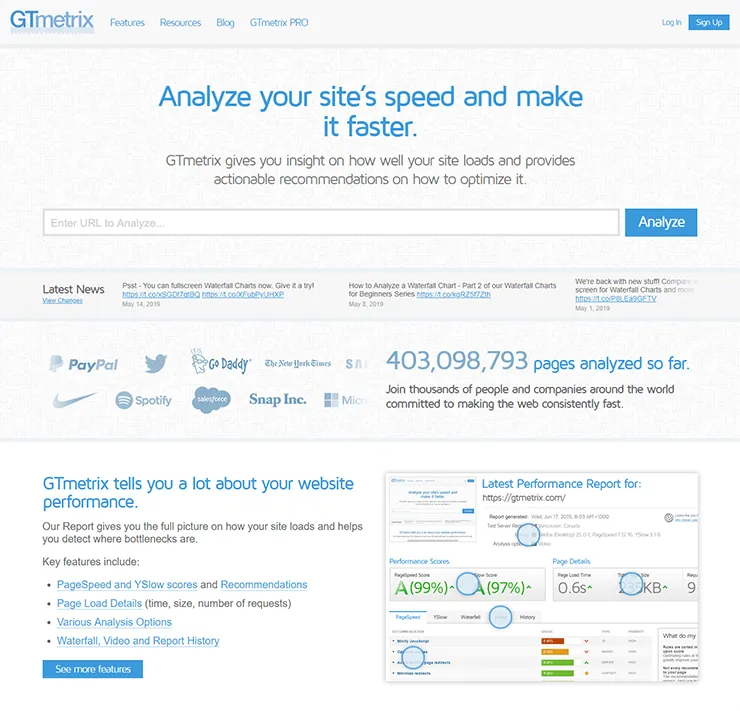
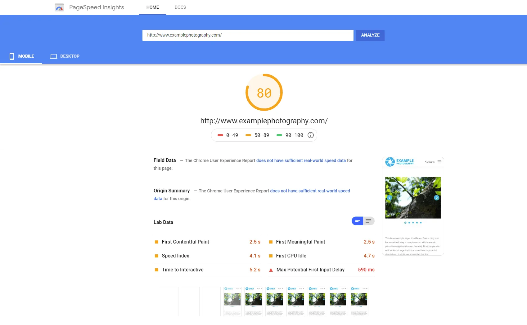
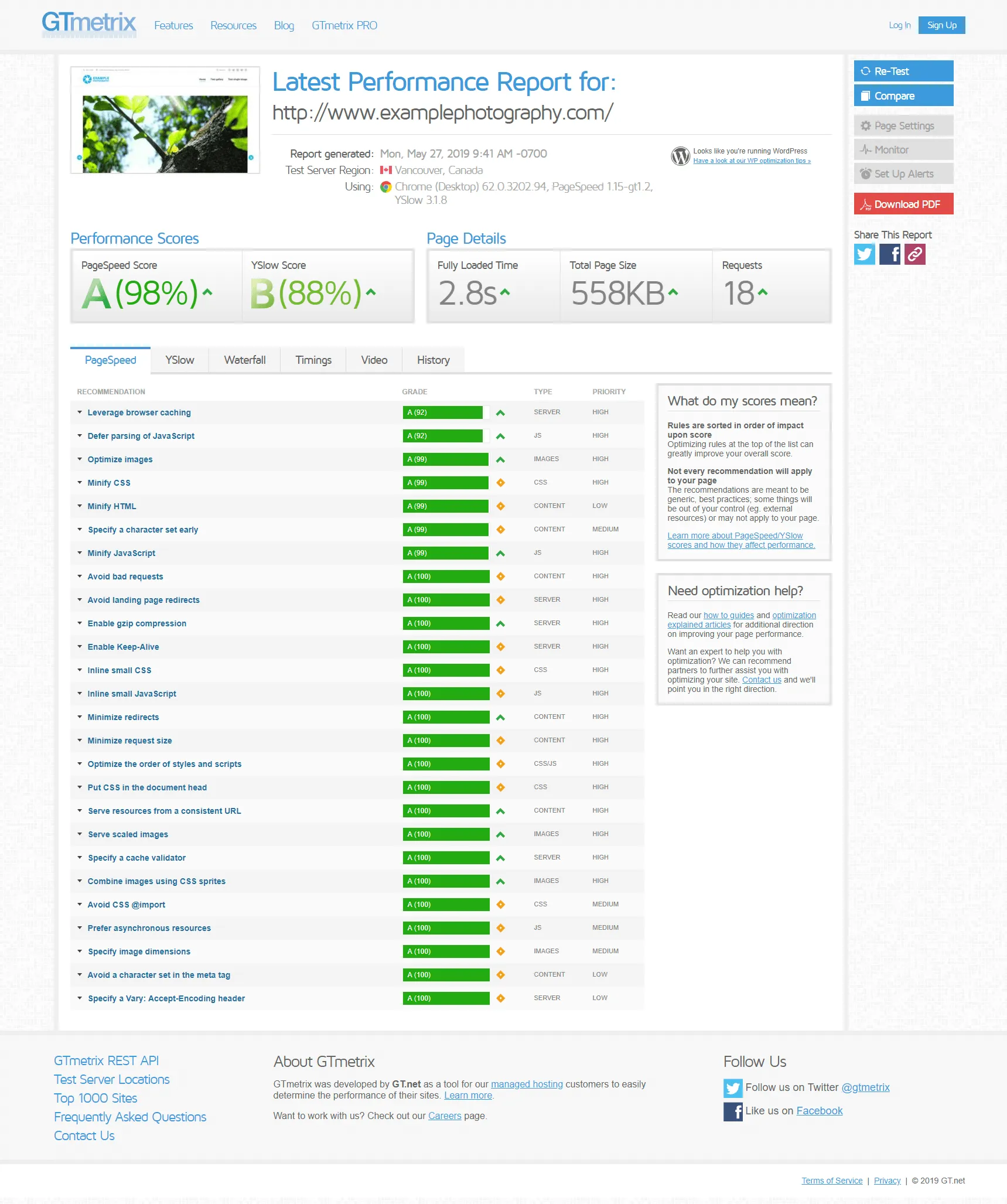
Before diving into image-specific testing tools, know that you can gain a lot of insights from these two popular website speed testing tools: Google PageSpeed Insights and GTmetrix.
-

- Google PageSpeed Insights

-
- GTMetrix
They do a pretty good job of outlining technical problems with your site’s performance, including poor use of images (images too big, wrong file formats, uncompressed files, etc.)
As an experiment, I’m reviewing a sample homepage using a 5-image slideshow along with some extra text and a smaller single image below.
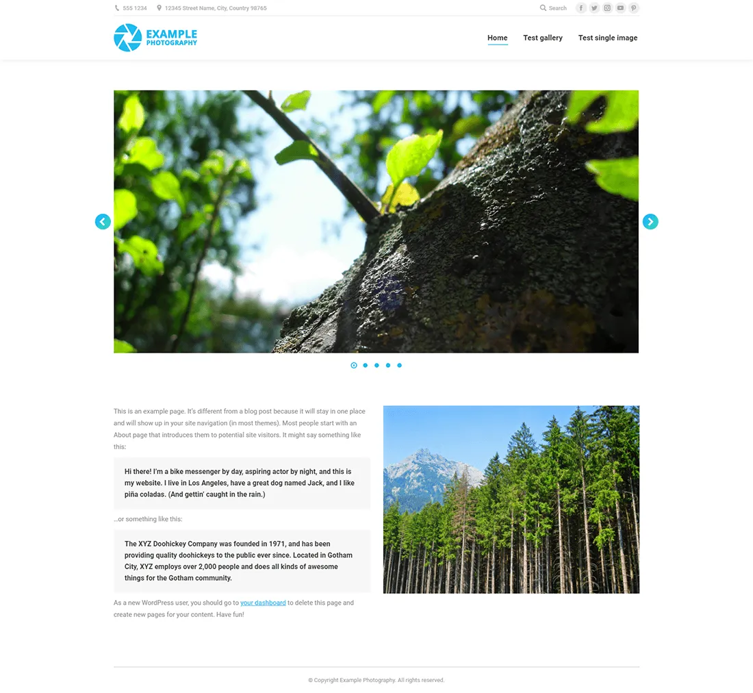
The page intentionally does a lot of things wrong in order to highlight its problems in testing tools:
- no performance plugin whatsoever
- no lazy-loading feature
- high-res JPG images uploaded, uncompressed
The Google PageSpeed Insights report outlines some important performance opportunities that you might encounter on your own site:

Let’s take them one by one to deconstruct their meaning:
a) Properly size images

In this case, Google is telling you that you shouldn’t upload high-res files to your site and then just display them at a smaller size on the page. While the browser is responsible for resizing the image to fit its container, it still has to download the full file from the server, taking up more time and bandwidth.
That means that images should only be sized as large as needed by your page layout (see part 1 of this guide).
Some WordPress plugins aim to automate this process by detecting the user’s screen size and serving properly scaled images:
- ShortPixel Adaptive Images (which is a separate plugin from their main ShortPixel plugin) serves smaller image sizes using their CDN, so don’t use it if ranking in Google Images is important to you. Why? Because using an external CDN might affect SEO. It’s complicated.
- Adaptive Images for WordPress is a free alternative that generates smaller image sizes directly on your site (only for mobile devices, you can specify the breakpoints)
At the very least, use a plugin like Resize Image After Upload or Imsanity to automatically resize high-res images to a more “decent” maximum size, but be aware that they both strip EXIF metadata from resized images.
Or better yet, use a plugin like ShortPixel or Imagify to both restrict maximum image sizes and still keep EXIF tags:
b) Defer offscreen images

On the first page load, only a few images are likely to be seen straight away (those that are “above the fold”). Loading all the other ones (lower down the image) can be delayed until other critical site resources have finished loading.
This process is called “lazy loading” and is a critical step in website speed optimization, especially when considering how image-heavy pages load on mobile devices (with slower connection speeds).
Fixing this issue is relatively simple. Just use an image optimization plugin that supports the lazy loading feature:
- Smush has the feature built-in
- ShortPixel has it’s accompanying “ShortPixel Adaptive Images” plugin for lazy loading and other cool features
- Imagify works well with the free “Lazy Load by WP Rocket” plugin. My favorite performance plugin – WP-Rocket – has the feature built-in.
- The “a3 Lazy Load” plugin is specifically designed for this feature
c) Serve images in next-gen formats

JPG is the dominating image file format on the web, but it doesn’t mean it’s the best. WebP, in particular, is a format that’s promoted by Google and that’s slowly getting traction.
But your JPG-based photo capture and upload workflow will likely stay the same for a few years to come, especially since WebP browser support is not yet that good.
But what you can do is use a plugin that can generate WebP images and then automatically deliver them to compatible browsers:
- WebP Express does this job very well
- Shortpixel has the feature built-in

- So do Smush and Imagify
- If you use Cloudflare, you can also enable such a feature:
d) Efficiently encode images

Google determined that your image file sizes could be smaller, even with a pixel-perfect lossless compression. That means that your current images are not optimized to the max.
Simply use a good image optimization tool (like the ones mentioned throughout the article) to handle the image compression for you, at the quality level you’re comfortable with (“lossless” for photography perfectionists, “lossy” for everyone else).
Let’s now look at the GTmetrix report:
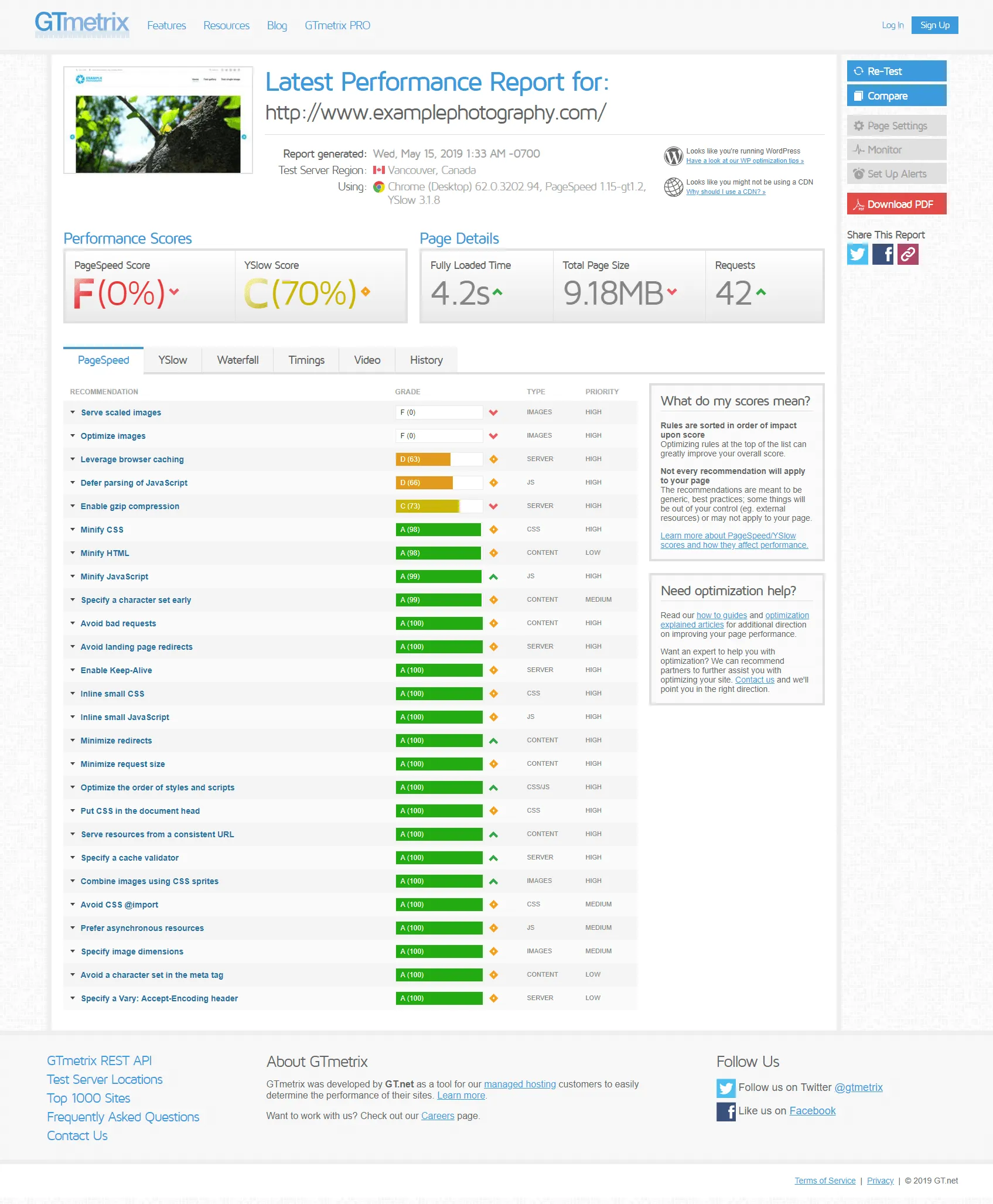
Update: Since writing this article, GTmetrix changed their reports and now focus more heavily on Core Web Vitals. But the basic principles of making a website fast remain the same.
a) Serve scaled images
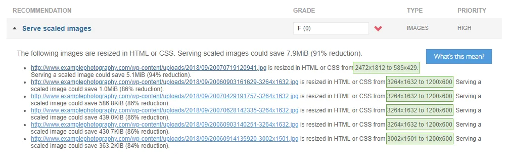
It’s similar to the “Properly size images” issue in Google’s test. You can see that GTmetrix identified the right size at which those images were being displayed on the page.
Make sure your photos are correctly sized based on your page usage (see part 1 of this article).
b) Optimize images
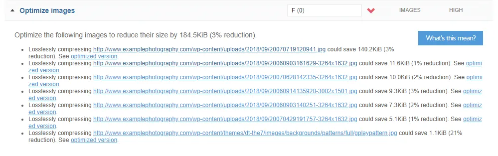
Similar to the “Efficiently encode images” issue in Google’s test.
Use a good image compression service/tool.
Implement as many of the image optimization tactics explained above, and you’ll see considerable improvements in the performance tests:
-

- Google PageSpeed Insights report after fixing image issues
-

- GTmetrix report after fixing image issues
Alternatively, you can use this great new performance tool: Page Weight by imgIX

Type in your URL, and it analyzes how images affect your page load speed; here’s an example:
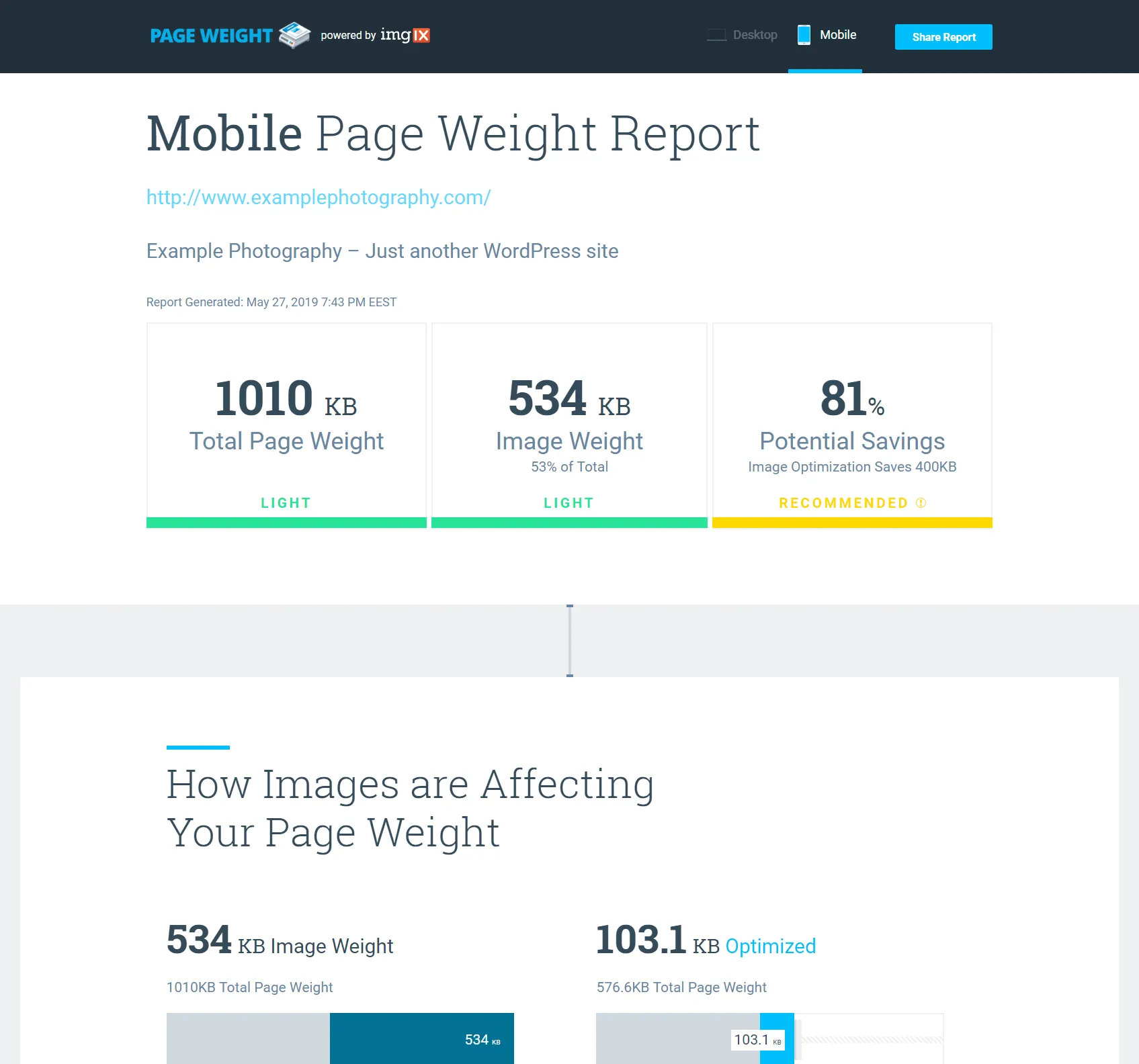
Please be aware though that it can throw “false negatives”: the report can sometimes tell you that you should resize a specific image to a smaller size than what your site actually needs.

 The tool suggested an image dimension of 335×251 pixels, when in fact we can measure that the site displays it at a larger size. That’s why it’s important for you to manually determine the right dimensions for your images (see part 1)
5. Website image size troubleshooting tips & FAQs
This all sounds too complicated. Can you just tell me what to do? What size should images be for my website?
All right, here’s a recap.
First of all, follow these vital web image size standards:
- Never upload high-res files to your site (unless you’re selling them as prints or licenses). Only pixel dimensions matter on the web, you can ignore DPI.
- Images that end up in galleries & portfolios can be sized at around 2000px on the longest side, maybe even smaller for vertical images (let’s say 2000px in width for horizontal images, and 1500px in height for vertical images).
- Smaller images used throughout your site (site logos, client logos, portraits, other graphics), should be sized as large as they’re displayed (which you can find using your browser’s developer tools mode).
- Save images at a medium quality level to lower file sizes (like 60-70% for JPG files). Some images work better in other file formats (like PNG or SVG), you have to test.
- Always use an image optimizer tools/plugins (usually using a lossy method – not lossless)
- In the end, all images on your website should have less than 500 KB in file size!
Beyond those guidelines, here are 3 different strategies for optimizing website images, depending on your level of involvement:
a) The “I’m very busy” solution
For photography-specific platforms like PhotoShelter or SmugMug, no action is needed.
WordPress users, install either ShortPixel or Imagify, and configure it to:
- automatically optimize images on upload
- backup original images
- enable lossy/normal compression
- resize large images (to a max of 2000px)
- generate WebP Images
- optimize retina (for which you also install the WP Retina 2X plugin, they work really well together)
- activate the Retina image optimization in the Advanced tab of the ShortPixel Settings
And then, using the plugin you just installed, do a bulk optimization of your past images.

Depending on the number of images in your Media Library, you can get a one-time plan to handle all your images in one go.
For other platforms (SquareSpace, Wix, etc.), prepare the images correctly on your computer, by following the guidelines above, and then also run them through a free tool like these.
b) The “I have time, but my budget is zero” solution
You start by preparing images on your computer at the right pixel dimensions and a compression level you’re comfortable with.
Sure, WP plugins can do the resizing and compression automatically, but the upload process is much slower that way, and it’s better to be in full control over the quality of your images.
When compressing images on your computer first, you can double-check if the quality level is good enough (with a small file size, but without any visible noise or JPG artifacts).
Obviously, Adobe Photoshop or Lightroom don’t fall under the “free tools” umbrella, they’re quite expensive in fact, but most photographers have and use them. If you don’t, here are some free image editing Lightroom alternatives you could use, along with some free image compression tools.
When you upload the images to your site, you’d still use a plugin like ShortPixel or Imagify (or some of the other free web tools if you’re not on WordPress), but you’d configure them to do a lossless compression on your images, that’s it.
Both plugins have free tier options, you’re simply limited to a monthly quota. Once you’ve optimized a certain number of images in a month, you’ll have to wait for the next month for the quota to reset.
c) The “I want it all to be perfect” solution
If website performance is of utmost importance to you, here’s an overview of the “perfectionist” workflow:
- Determine the pixel dimensions needed, based on your website design (see part 1 of this guide)
- Export your images (at the previously-determined dimensions) at a quality level you’re OK with. This might require doing some test runs and playing around with the export quality settings, until you’ve found the “middle ground”: a high-enough compression level so that file sizes are small, but not too much compression to start introducing visible artifacts. Usually, that’s around a 60-70% quality level, but it depends on your types of images.
- At this point, you could either use a WordPress plugin directly or use stand-alone image compression tools if you’re not using WordPress.
- For WordPress users, choose between ShortPixel and Imagify, configure them as I outlined above. Also, install the free WP Retina 2X plugin to help with creating retina images.
- Start uploading the images to your Media Library. The site will now automatically compress your images.
- Test and re-test your site’s speed. Check out the “Website testing tools” section.
Do I need to size images in three (or more) different ways for people on different size devices?
No. Your website platforms should do that automatically for you.
For example, here’s what WordPress does:
1. Whenever you upload an image, it also generates 3 other image sizes alongside your original: thumbnail (150×150 with cropping), medium (max 300×300 without cropping), large (max 1024×1024 without cropping)

I recommend changing those defaults to suit your site’s template design. Look at how large your thumbnails are being displayed in grids, and set that as the “Thumbnail size” (and consider disabling the “Crop” option to respect the initial aspect ratio of your images).
And if you know what you’re doing, you can add other automatically-generated image sizes using a plugin like Simple Image Sizes (link). After making changes, be sure to regenerate all thumbnails again.
2. WordPress then adds some special code to the site to load images in a responsive manner, belling the browser to use the proper image/thumbnail size depending on the screen size:

So unless your platform completely doesn’t support responsive images, you should only upload one single image version, and then let your platform, your template/theme, or a plugin do the rest of the work.
How about adding a simple table with all the image sizes?
A table is only possible for full-screen images, and even then, just the desktop versions matter (2000px on the long edge). For mobile and tablet, the WordPress theme should be smart enough to automatically generate smaller versions of the images depending on the device size. It’s not something that the website owner needs to prepare beforehand.
As for any other images on the site (not full-screen images), a table is not possible because image sizes depend on the site design. For example, one site might have a blog area designed to be 800px wide, so images need to be 800 x 2 = 1600px wide (for retina screens). But another site might have the blog at 600px wide, so all that changes. That’s why there are no fixed values I can put in a table.
Wix recommends uploading images of AT LEAST 3.000 pixels, should I do that?
Absolutely not.
Wix does indeed recommend uploading high-res images, which the platform them automatically compresses and resized depending on the template needs.
If the image is used in a large slideshow, Wix generated a larger JPG image. If used as a thumbnail, a smaller-sized JPG is generated.
And that’s all great, website performance is generally taken care of.
But… people can still get access to the high-res images (if they know how to tweak the URLs of those images).
So for image protection purposes, only upload compressed images at the pixel dimensions needed by your page layout (up to a maximum of 2500 pixels on the longest edge).
I’ve optimized my images, and they’re all below 500KB, some even below 200KB, but my page is still slow to load. What gives?
Images are just one factor when it comes to website performance. Other issues might be affecting your page load speeds:
- slow hosting server
- problems caused by faulty plugins
- javascript errors
But when it comes to images, don’t forget that it’s also a matter of quantity: you should limit how many images you have on a single page:
- for portfolios, it’s a good idea to narrow your selection down to your absolute-best photos (read more on this topic)
- galleries should use pagination to break them down to 25-50 thumbs per page
- for main blog index pages, only show blog post excerpts (and featured images) instead of listing the entire post contents (here’s why)
- on individual blog posts, try to limit the number of large images to 10-15, there’s usually no need to have more. Wedding photographers, in particular, have the bad habit of treating blog posts as portfolio pages, listing a ton of images from each event.
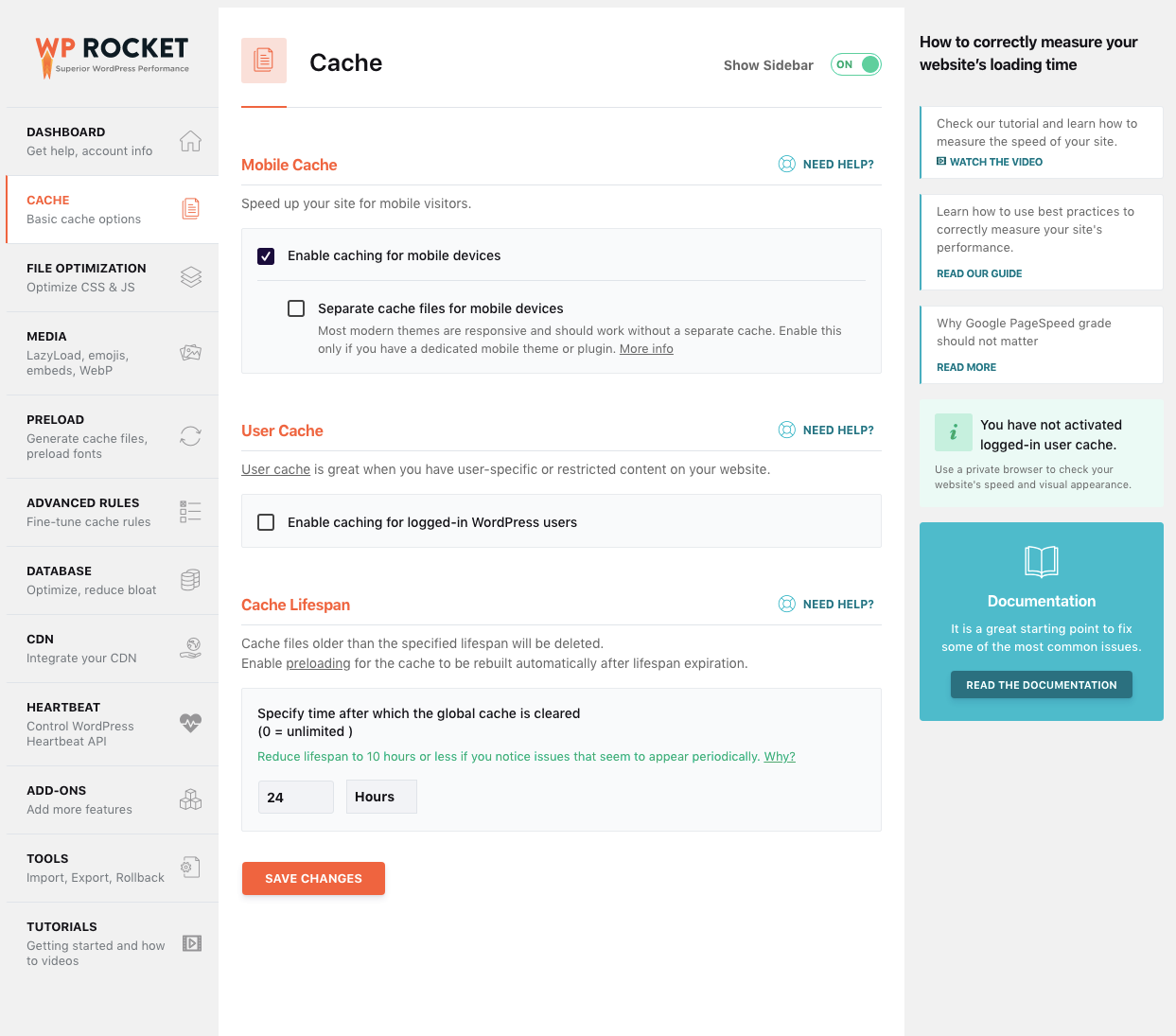
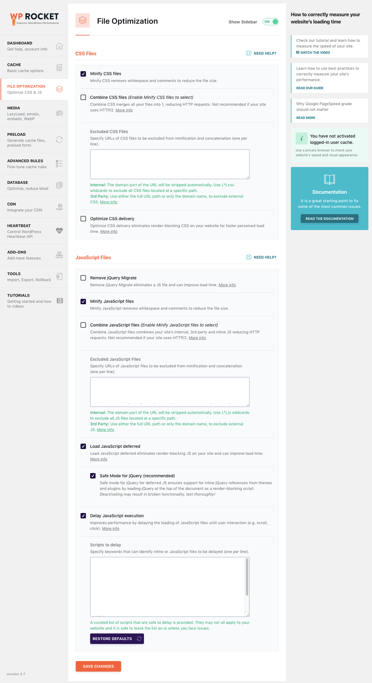
Besides image optimization issues, what WP caching plugin do you recommend?
Without a caching plugin, for every page on your site, WordPress needs to generate the final HTML code based on tens of PHP templates and functions (from the WP core, theme and all plugins). Caching solves this by saving a copy of the final HTML code, and delivering that to browsers quickly.
For this, I highly recommend using WP Rocket, it’s a premium plugin (so it’s not free), but it’s incredible powerful and easy to use, you can’t go wrong with it.
Here are just a few of its performance options:
Find it too expensive? Email me to ask for a few up-to-date free alternatives, happy to help. I can install and configure the WP Rocket plugin (with a premium license) as part of my performance optimization service.
I followed instructions, but my images still look too “soft” on the site. What should I do?
When an image gets resized, it loses some sharpness. This can happen at two different stages:
1. When you export images
After exporting images on your computer, make sure they look well there before uploading them to the site.
If they’re too soft, you might need to apply some output sharpening (low, standard or high) when exporting them:

2. When the browser resized the images on the site
That usually means that you haven’t correctly uploaded images at the right pixel dimensions, and the browser is having to resize them on the fly to the size needed by your theme/template.
The “soft” look is more pronounced when only a small amount of resizing is needed. For example, if you uploaded an 800px image and your blog template only displays it at, let’s say, 799px, the image will look very blurry.
Why? Because browsers do a sloppy pixel interpolation job because they prioritize speed over quality. The “image-rendering” CSS property aims to allow more control over this process, but browser support is limited.
That’s why it’s important to correctly determine the correct pixel dimensions needed for your images (see part 1)
What about retina screens?
I took high-PPI “retina” screens into consideration when talking about image dimensions (in part 1).
In short, here are the best-practices of image optimization for retina screens:
- when considering how to size your images (depending on their usage on your site), it’s OK to double that size so they look really crisp on retina devices
- but there’s a limit, I don’t recommend going above 2500 pixels (on the longest edge) unless you really know what you’re doing. For example, a 27″ iMac has a resolution of 5120 x 2880. You wouldn’t really have images that large in a full-screen slideshow, would you? They’d load terribly slowly (due to their large file size), and ill-intended people can also steal them from your site.
- when preparing double-sized images, it’s good practice to save them with “@2x” at the end of the filename (before the file extension)
- for WordPress sites, the gold standard is using the WP Retina 2x plugin which helps you generate larger-sized thumbnails in the admin area and then delivers them automatically to capable devices.
- by the way, WP Retina 2x works well with the ShortPixel Optimizer ;-)
Should I let plugins automatically strip EXIF metadata from my images?
Removing EXIT metadata can indeed help reduce file sizes even further.
The team behind ShortPixel did a quick study on over a thousand images and concluded that removing EXIF data leads to files that are 8.5% smaller.
Some image optimization services let you choose whether to strip the metadata; some don’t. In practice, the portion of the filesize taken up by metadata is quite small with larger images, but it can make a big difference, proportionally, for smaller images. (source)
At the moment, it’s not clear if Google actually uses any EXIF data as a ranking factor:
SEO experts say that Google might use EXIF data in the future (for finding the original source of an image, for showing geo-data / GPS coordinates to help with local rankings, and for showing EXIF-based filters in Google Images), but it’s unclear when.
Until Google makes it all more clear, I personally think it’s best to keep the image metadata. The 8.5% file size reduction is not worth the potential SEO benefits.
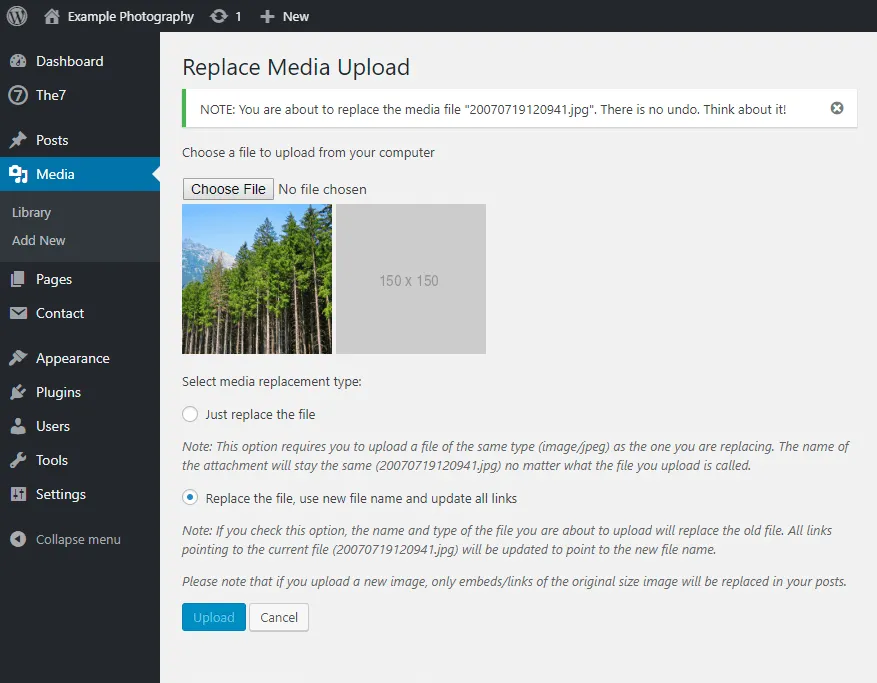
I need to fix some of my old images. Should I just delete them and upload new ones?
Deleting old images from your Media Library is risky because any references or links pointing to them might get broken. So only delete them when you’re sure they are no longer being used anywhere on your site.
Uploading new (similar) images can also get out of control quickly, over-crowding your site’s Media Library.
A cleaner method for WordPress site owners is to use the free “Enable Media Replace” plugin to overwrite old images.
What about image sizes for social media sites?
This guide is only focused on website images. For guidelines on creating social-media friendly images, check out this Always Up-to-Date Guide.
What about image SEO?
This guide is focused solely on image dimensions and file size.
Check out my separate guide to learn about important image SEO guidelines: image filenames, ALT tags, captions, EXIF data, etc.

I’m worried about image theft. What should I do?
You could try to disable right-click and drag-and-drop saving of images on your site (like the excellent “WP Content Copy Protection” WordPress plugin), but there’s still no 100% safe way.
Hackers can still get access to your original-sized photos from your site’s source code or by taking screenshots on your site.
While you can’t prevent this completely, you can try to limit the dimensions of your site’s images so that their possible usage is limited: smaller images can’t be used for high-res graphics, can’t be printed at decent sizes, and can’t be resold on stock photography sites.
Here are some strategies for mitigating the risk of image theft:
- Set a smaller maximum dimension for your images. Only upload images at 1200 pixels (on the longest side) instead of 1500-2000px.
- No more increasing image sizes for retina screens (even though they won’t look as sharp)
- Compress JPG images to a lower quality. Again, the goal is to limit the image usage possibilities for the “thieves”.
- Watermark your images to further prevent people from re-using them.
Keep in mind that these are all compromises: you’re increasing protection at the expense of visual impact. High-quality unwatermarked large images will always have a bigger “wow” factor.
Is it enough to only optimize images on the homepage? Or do I need to work on my entire site?
Optimizing your homepage speed is a start, but it is not enough.
Google doesn’t rank your entire website based on your homepage alone.
And neither do users. They might have a good experience on your homepage, but if then they navigate to a very slow page, they still leave your site.
Does using a slideshow affect site speed?
Yes, it can. Unless the slideshow is properly coded, has optimized images, and uses lazy loading, slideshows can negatively affect user experience and SEO.
Read this detailed article for what you can replace homepage slideshows with: Homepage slideshows are dead – 4 better ways to design the top of your website front page
What are the file naming conversions for different image sizes?
Not talking about SEO filename conversions (using keywords in the image file names, like “alaska-northern-lights.jpg), but about how to name different sizes of the same image file.
This only applies when you manually generate images at different sizes, normally not needed for a WordPress site (which automatically generates “thumbnail”, “medium” and “large” versions of your photos after upload).
Here are some possible options for different-size variations when you start with a file called “alaska-northern-lights.jpg”:
- Option 1: DASH + size name
- alaska-northern-lights-small.jpg
- alaska-northern-lights-medium.jpg
- alaska-northern-lights-large.jpg
- Option 2: DASH + size in pixels
- alaska-northern-lights-300px.jpg
- alaska-northern-lights-800px.jpg
- alaska-northern-lights-1500px.jpg
- Option 3: DASH + @ symbol + size modifier
- alaska-northern-lights.jpg (original)
- alaska-northern-lights@0.5x.jpg (half smaller version)
- alaska-northern-lights@2x.jpg (double version for retina screens)
There’s no meaningful SEO difference between them, so choose the naming convention you prefer, to be able to reference and use the files on your site quickly.
Why is my website slow?
I can’t possibly answer this here, without reviewing your website first. It’s quite a slow and detailed process, it requires a lot of testing and digging through your site admin area and source code. That’s why I charge for such work: Website performance optimization service
What I tried doing with this article is give you the knowledge to try to test things yourself, and to make you understand what all of the page speed opportunities mean.
What are some common misconceptions about website speed?
This has been brilliantly covered in this Google Search Central video:
Pro tips for developers
A few advanced image optimization guidelines for web experts:
- for smaller site graphics, consider using vector images (SVG with GZIP compression) instead of JPG and PNG
- or better yet, use CSS effects wherever possible: filters and blending modes, borders, and outlines, shadows, rounded corners, gradients, simple animations, etc.
- and use web fonts (as opposed to overlaying text in images)
- CDN usage can further improve load speeds, but be mindful of the SEO implications of serving images from a different domain.
- WebP image delivery is slowly becoming the norm, so make sure the site automatically generates and sends WebP image versions to compatible browsers
- Lazy loading images is a must (see the “4. b) Defer offscreen images” section above)
- you could also explore image processing & delivery services like ImgIx, Cloudinary, Sirv, ImageKit, ImageBoss, Gumlet: they do a lot of the heavy-lifting, especially useful if the site needs a lot of image manipulations (automatic resizing, cropping, watermarking, etc.)
- and, of course, testing, testing, testing
Still looking for more geeky info?
- Start by reading Google’s “Image optimization” article as part of their Web Fundamentals guides, and then their other “Automating image optimization” guide.
- Another excellent guide for developers is “Fast load times” tutorial from web.dev
Conclusion
As mentioned in the beginning, these image optimization standards don’t really apply to photo archiving services like PhotoShelter or SmugMug (which have built-in security measures, and which generate low-res thumbnails from your original high-res files, as needed by the site), or whenever you sell those images as downloads or prints.
But if you have a self-hosted site and just need to showcase your images on the web, following these image optimization best-practices is a must.
So take some time this week to:
- update your image exporting & uploading workflow (see parts 1 and 2)
- go back and optimize your site’s existing images (see part 3)
- test your site’s performance before and after the changes (see part 4)
How are you optimizing your images? Leave a comment below (after checking the FAQ section) and share your insights!
Still trying to make sense of this whole image‑optimization thing?
Check out my Image optimization for website performance (video guide)
Learn more about image optimization for improving page load times, on a live website demo: sizing your images, how to export and compress them, what tools to use and how to configure performance plugins, how to test your site’s speed and understand the performance reports, and much more!
Image SEO essentials: How to optimize for Google Image search to drive more traffic to your photography website
Need help improving your website speed?
Check out my dedicated website performance optimization service.


