Contents
If you run your site through Google’s Mobile-Friendly Test, you either get the green light, or you don’t.
In reality, your website can be more or less friendly for mobile users, it’s not a binary thing. Even if you pass Google’s test, it’s not a given that users find it very easy to navigate your site from a phone.
So let’s review the different levels of mobile friendliness, which all come down to offering a good user-experience (UX):
Level 1: minimum mobile usability
This is where you DON’T pass Google’s mobile-friendly test because it’s not responsive at all, but at least it’s usable.

First of all, that means not using flash, of course. I can’t believe I’m still recommending against flash after all these years, but I still see photography websites out there that haven’t transitioned to HTML5 templates.
When loading such a site from their smartphone, users should at least be able to pinch and zoom to move around. It’s cumbersome and annoying, but it works.
Another scenario here is if your site’s desktop version has some really complex elements (which rely heavily on Javascript or Ajax), which simply wouldn’t fit or work well on mobile screens:

On mobile, it can default back to a simple text-based list:

Sometimes your site is responsive, but there are just a few pages which have mobile issues. Be sure to use Google Search Console, it will notify you when it finds mobile usability problems:

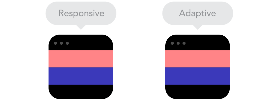
Level 2: adaptive theme/template
At this level, the website uses a mobile-friendly template that automatically refactors the content on smaller screens.

Multi-columns layouts switch one below the other. Thumbnail grids only show 1-2 images/row on mobile devices (and maybe 3-4 on tablet).
Adaptive themes simply use specific breakpoints (= website widths in pixels) based on popular mobile screen resolutions, to know when to switch to a “mobile layout”.
It’s somewhat limited, but it’s definitely a UX improvement. Users are no longer required to zoom in on your content, they can simply swipe up and down to see your page.
Almost all popular photography websites out there work this way. And it’s great that all website platforms out there have been offering mobile-friendly templates for years already.
Level 3: responsive/fluid mobile experience
On top of your adaptive site theme, website owners add custom CSS code to further improve how the site “behaves” on smaller screens.

It’s no longer by using fixed breakpoints, but by thoroughly testing the site and deciding, for each piece of content, how it should be displayed as screen size decreases.
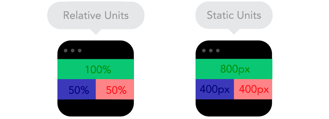
Here’s a simplified example of a small About page:

As you make the browser window smaller, it’s fine for the text block to shrink a bit, while the portrait image stays in place.
But as you reach a certain point, text readability gets affected (with text width becoming too small), so the website then switches to a single-column layout instead.
Level 4: mobile-first approach
The most advanced option (usually implemented by large websites and which requires a lot more development work) is to start with mobile users.
The website is built, from scratch, by designing the mobile experience first. And as screens get bigger, more features & content are added to the site.
The side benefit here is that you end up creating a cleaner design overall, which eventually helps you desktop design as well.
Conclusion
It’s clear these days that without a mobile-friendly website, your organic traffic can plummet:

For many photographers, mobile visitors make up more than 50% of the entire site traffic. And mobile usage is only going to get bigger in the future.
So, how is YOUR website’s user-experience on mobile?
Recommended reading:
- Google penalizes non mobile-friendly websites
- What to do if your website is not mobile-friendly?
- 9 basic principles of responsive web design
This last article brilliantly explains mobile concepts with clever animations like:


