Contents
One of the most under-utilized ways of improving your photography website, call-to-action buttons can encourage visitors to perform the actions you want them to take on your site (whether that’s contacting you, booking a photo shoot, viewing your portfolio, etc.)
What are call-to-action buttons
- They are the links pointing to actions that you want your visitors to take on a specific page.
- Usually styled as buttons (unlike simple text links), sometimes quite prominently (think of big colorful buttons, sometimes with arrows or icons inside them).
- They are most commonly found at the end of pages, but can also appear multiple times per page if you have sections covering different topics. Longer pages also allow repeating the same buttons if needed.
Why CTAs are important
Simply because you want people to take specific actions on your site, and you want to guide them.
Please note that we’re not forcing people to take a specific action. Using a sleazy pop-up on page load (interrupting users from viewing your content) is technically also a call-to-action (asking them to subscribe or visit a page). But that’s actually hurting the user experience.
What I’m referring to in this article is simply guiding visitors to the next appropriate page using inline buttons, where appropriate. Visitors are still free to browse around your website in any way they prefer.
This is, of course, where the navigation menu plays an important role. Make sure you first have that optimized to perfection before working on calls-to-action: Navigation menu best‑practices for photography websites
Create a navigation “flow” through your site using one single CTA (or two at most) per page
You can’t give visitors too many options; that will only confuse them even more. They already have the option of using your site’s navigation menu, no sense in repeating that at the end of a page (in the form of buttons).
Decide on a single action (or two) that you want people to take after viewing a page. Point them to the next logical step to create a nice “flow” through your site.
A “flow” guides people from point A to point B.
You can have multiple such “flows” through your site because visitors usually have different entry points (see your Behavior > Site Content > Landing Pages report in Google Analytics). Some people visit your homepage directly, others see a portfolio/gallery first, while others land on a blog post initially. So you have multiple starting places.
The destination is usually the Contact page (asking people to contact you or book a session), but depending on your business goals, you can have other destinations: a prints gallery, a product page, your blog, or even a social media profile.
Here are a few examples of such “flows” (for common photography website structures):
- Homepage > Portfolio > Services/Pricing > Contact
- Pricing > FAQ > Contact
- Blog > About > Pricing > Booking form
- Homepage > Image galleries > Add-to-cart/Buy buttons
- Blog > Newsletter subscribe form
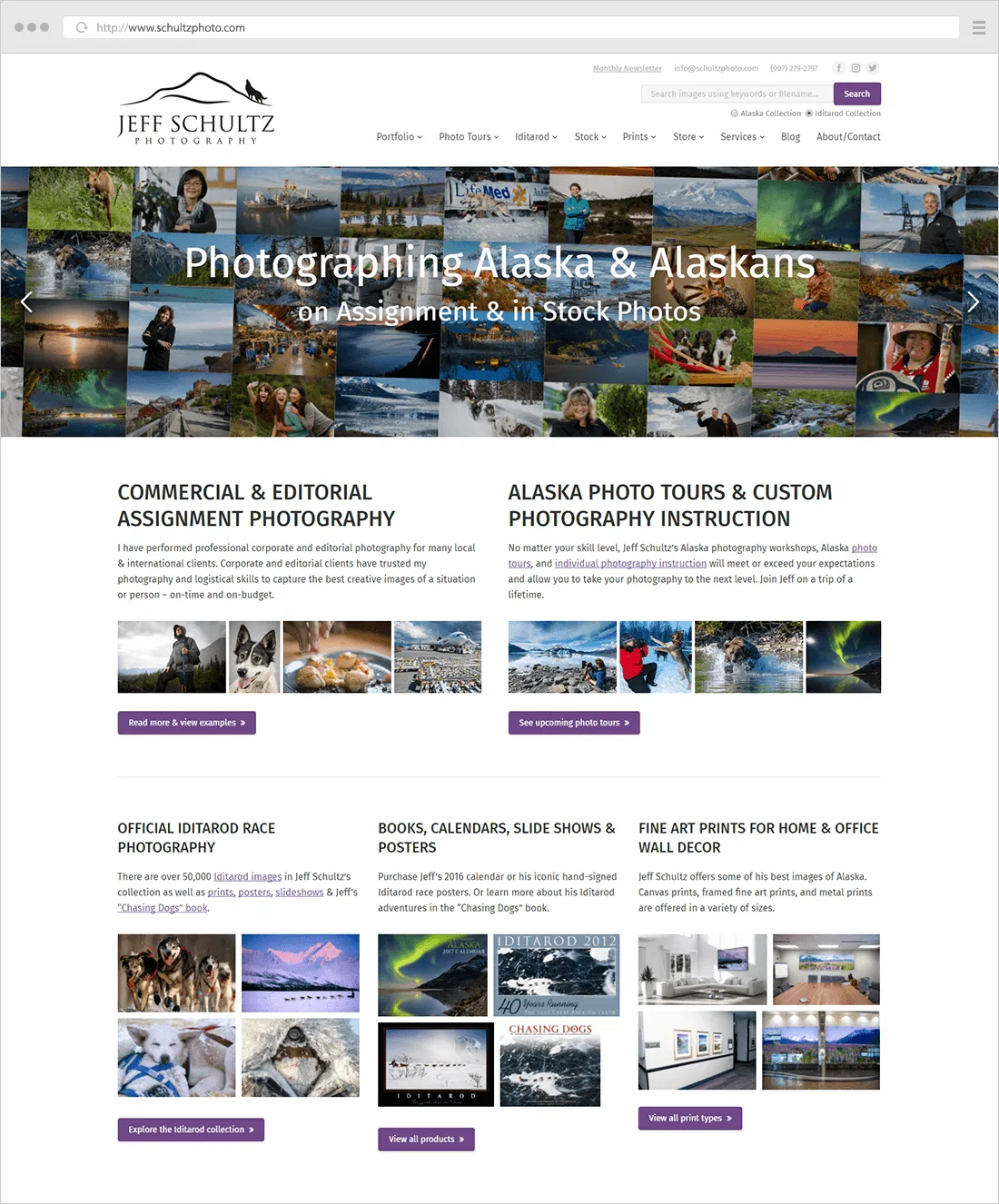
- Homepage > Photo Tours > Subscribe
The length of this “flow” depends on your service offering. If you do custom photo shoots which depend on the specific client request (so you need them to contact you first), most pages will have a CTA pointing to the Contact page. If, however, you do explain all your different packages/prices on your site, you can first point people to those pages.
And you can have multiple goals as well. Your blog pages take people to a newsletter subscribe page, while your bio and services/pricing pages take people to the Contact page. You can have multiple entry points and multiple destinations, you need to think of all possible scenarios.
Examples of CTAs on photography websites
A very clear example of such a flow is georgevivanco.com

They grouped together a few pages in a “Tour”, each page ending in a CTA pointing to the “next” page in the tour: Homepage (with a button called “Start tour”) > Welcome > Bios > Pricing > FAQs > Contact. Going through the entire tour, visitors get a complete idea of who the photographers are and what they offer. Portfolio and Blog pages are outside of the “Tour”, but they can always be accessed from the navigation menu.
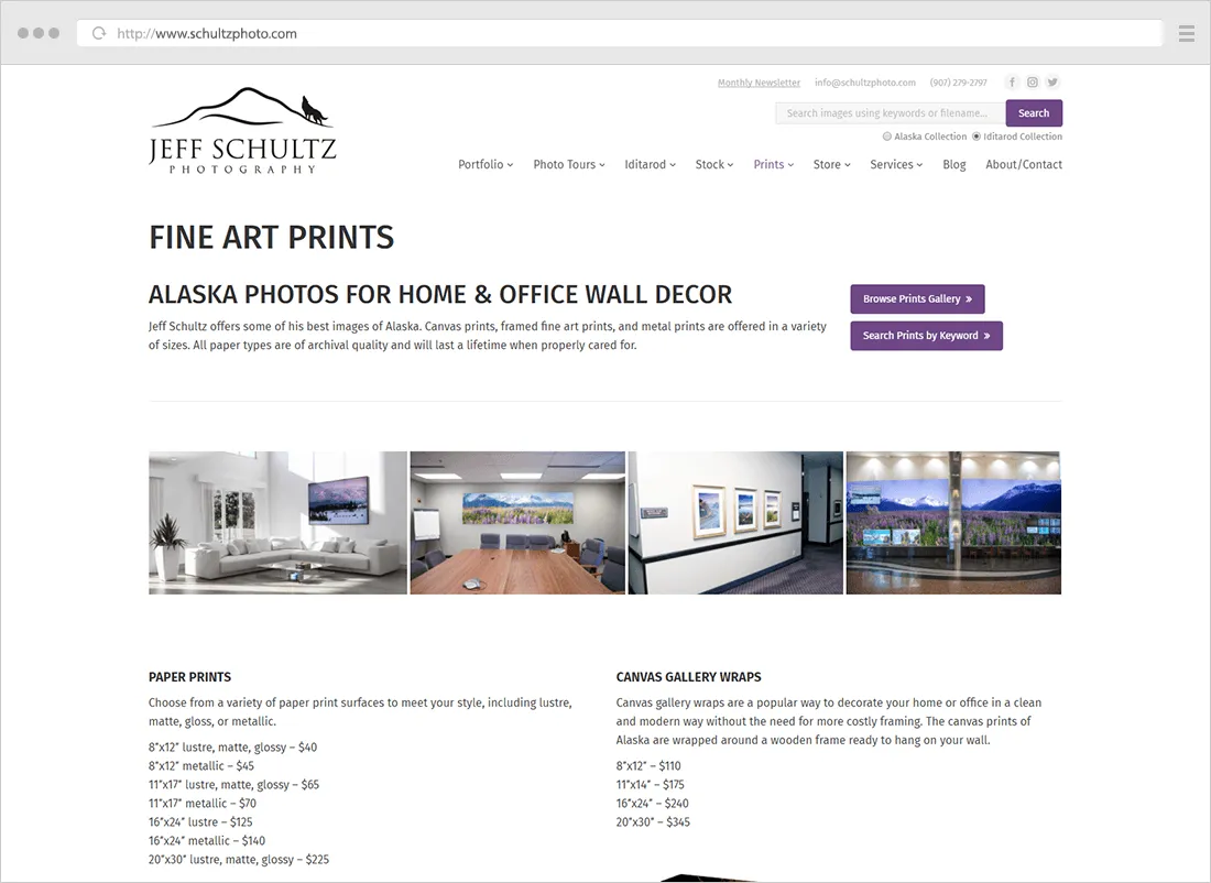
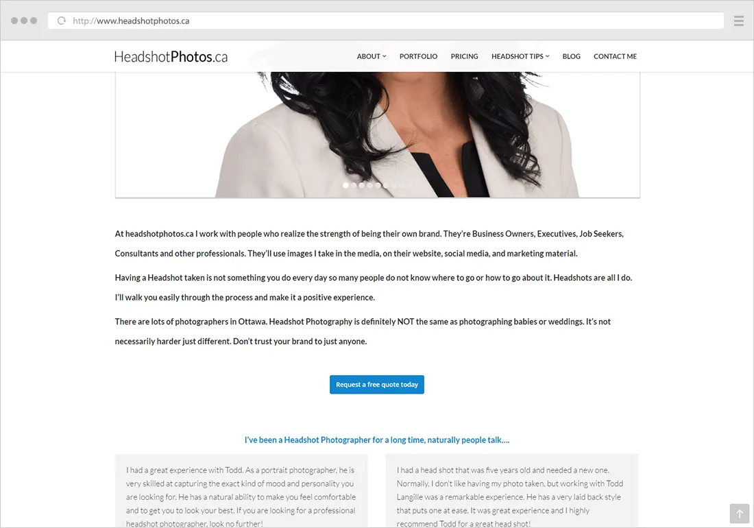
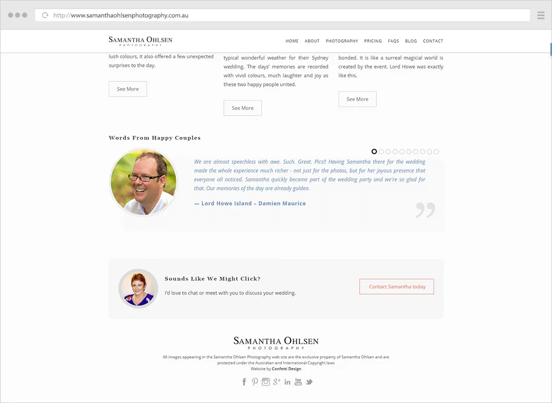
More examples of call-to-action buttons on photography websites:


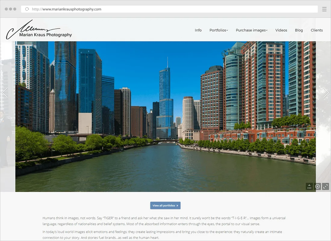
At the very least, work on your homepage
Regardless of what you currently have on your homepage (whether it’s a slideshow, a grid of images, or something else), what action do you want your visitors to take first? Which of your other pages are most important to be seen?
After viewing your homepage, should visitors…
- head straight to the contact page to leave you a message? (rarely the right answer)
- view a portfolio with your best images?
- read what you can offer on a Services page?
- dive deeper into your photography blog?
There is no magic formula, it all depends on your specific site structure and business goals. Choose one or two actions that you want people to take after viewing your homepage.
And if you have a complex site (with many different sections), the homepage can indeed have multiple CTAs, basically acting as a portal, as a recap of your site’s most important areas.

Guidelines for making CTAs more effective
Adding effective call-to-action buttons to your site can be incredibly powerful. But it’s also something very hard to master.
Once you’ve decided where to add call-to-action buttons on your site, follow these ideas to improve their conversion rate:
- use plenty of empty space around them, so they stand out and don’t feel cluttered
- make them large enough to attract attention, but not too large to overpower the entire page design
- try using colors that contrast the page background color. If you’re page is white or black, you can use an accent color from your design (that maybe matches your logo or other elements). The larger the buttons are, the more pastel colors you can use.
- when you have multiple CTAs together on a page, highlight the most important one (with a different color, or with a different font weight)
- use simple wording that clearly specifies the action, usually starting with a verb
You know you’ve done a good job if you notice improvements in the “Pages / Session” and “Bounce Rate” reports in Google Analytics (and you get bonus points if you set-up goals and funnels in GA).
Frequently asked questions
“Do you know if my website platform has the option of CTA buttons?”
You surely can, I haven’t yet seen a platform that doesn’t allow this.
Don’t forget that call-to-action buttons are just regular links (with some extra CSS code to make them look more prominent), all website platforms allow entering custom content and adding links.
Even if you’re not using something quite as flexible as WordPress, your website either has a visual page editor or allows editing the HTML source code of your pages. That’s all you need.
“I’m not familiar with coding. How do I add CTAs if I have access to the HTML code?”
No worries, you can use a free online button generator like these:
If you do have some HTML knowledge, but want to learn more about controlling all the CSS code details, start with these resources:
“Can I design my buttons in Photoshop (instead of using HTML & CSS code)?”
You could, yes.
But you can achieve almost anything with a bit of CSS code, and it won’t have any performance impact (like images do). Plus, HTML buttons are easier to edit and allow defining a hover state.
If however, you do decide to use image buttons, keep the file size as low as possible (8-bit PNG usually works best).
“Should there be a CTA on the Contact page?”
The only action you want people to take there is to contact you. So the only CTA is the submit button on the contact form, nothing else. (Actually, don’t call it “Submit”, but something like “Send” or “Send message”).
Any other CTA on the Contact page would be distracting, derailing people from contacting you in the first place. More about Contact pages here: The essentials of building an effective photography “Contact” page
“Should I have a CTA at the end of every gallery?”
Yes, you should.
Either point people back to your main portfolio (where they can view another gallery) or ask them to contact you.
“Should button texts be in all caps?”
Not necessarily, no. Whatever matches the rest of your website. A good rule of thumb is to match the capitalization used in the navigation menu.
I’m personally a fan of using uppercase for both the menu and any buttons.
“Should CTAs be positioned above the fold?”
Forget about the fold; people are used to scrolling these days, focus more on the quality of your content (to give them a reason to scroll).
CTAs usually sit at the end of pages (so not above the fold). You want people to take a specific action after they’ve consumed your content, not instead of it!
“I have multiple actions I want people to take on my website. Why can’t I add more CTAs?”
Because giving users more options might make them take no action. It’s difficult, but you have to prioritize.
You might indeed have multiple goals for your site, but your pages can serve different purposes. For example, you photo galleries are all about getting people to buy prints, while your blog posts are all about getting more newsletter subscribers. Your about page can lead people to view your portfolio, while your pricing page asks people to contact you. You need to figure out a “map” of how you want users to flow through your website. Like I mentioned in my article, you can have multiple “destinations” in mind.
“How do I know if CTAs are effective?”
If you have a decent amount of traffic, you should notice improvements in the “Pages/Session” and/or “Bounce Rate” reports in Google Analytics, eventually leading to more views of your “destination” pages (like your Contact page).
But if traffic is still very low (which makes Analytics reports statistically insignificant), you can only rely on noticing more results from your site (sales, email requests, etc.).
Further reading – more ideas for how to design your CTA buttons:
- 17 Best Practices for Crazy-Effective Call-To-Action Buttons
- Call to Action Buttons: Examples and Best Practices
- 31 Call-to-Action Examples You Can’t Help But Click
- “Call to Action” Buttons: Guidelines, Best Practices and Examples
- The 25 Best Words to Use in Your Call-To-Action Buttons
- How To Design Call to Action Buttons That Convert
- 11 Characteristics of Persuasive Call-to-Action Buttons
- Call to Action: The 10 Most Effective Techniques
Conclusion
I hope you’re now more aware of the usefulness of call-to-action buttons and how to use them. As you’ve often heard me say, be mindful of the user experience on your photography website: these CTA buttons are not meant to extract more sales from your visitors at any cost. They’re simply encouraging people to see your site’s most important pages instead of browsing aimlessly.
Please leave a comment below with any follow-up questions you have about call-to-action buttons, I reply to every single one.